More Blues, Autohinting, Part 3
Fine tune your family hinting for different sizes.

Here we’re going to take the back alley to the other blues. These blues brothers lurk in the underbelly of the font blues world.
But these are very important values!
These can radically change your font at different sizes.
Where are these values in FontLab?
Go to File > Font Info > Other Values > PostScript hinting.
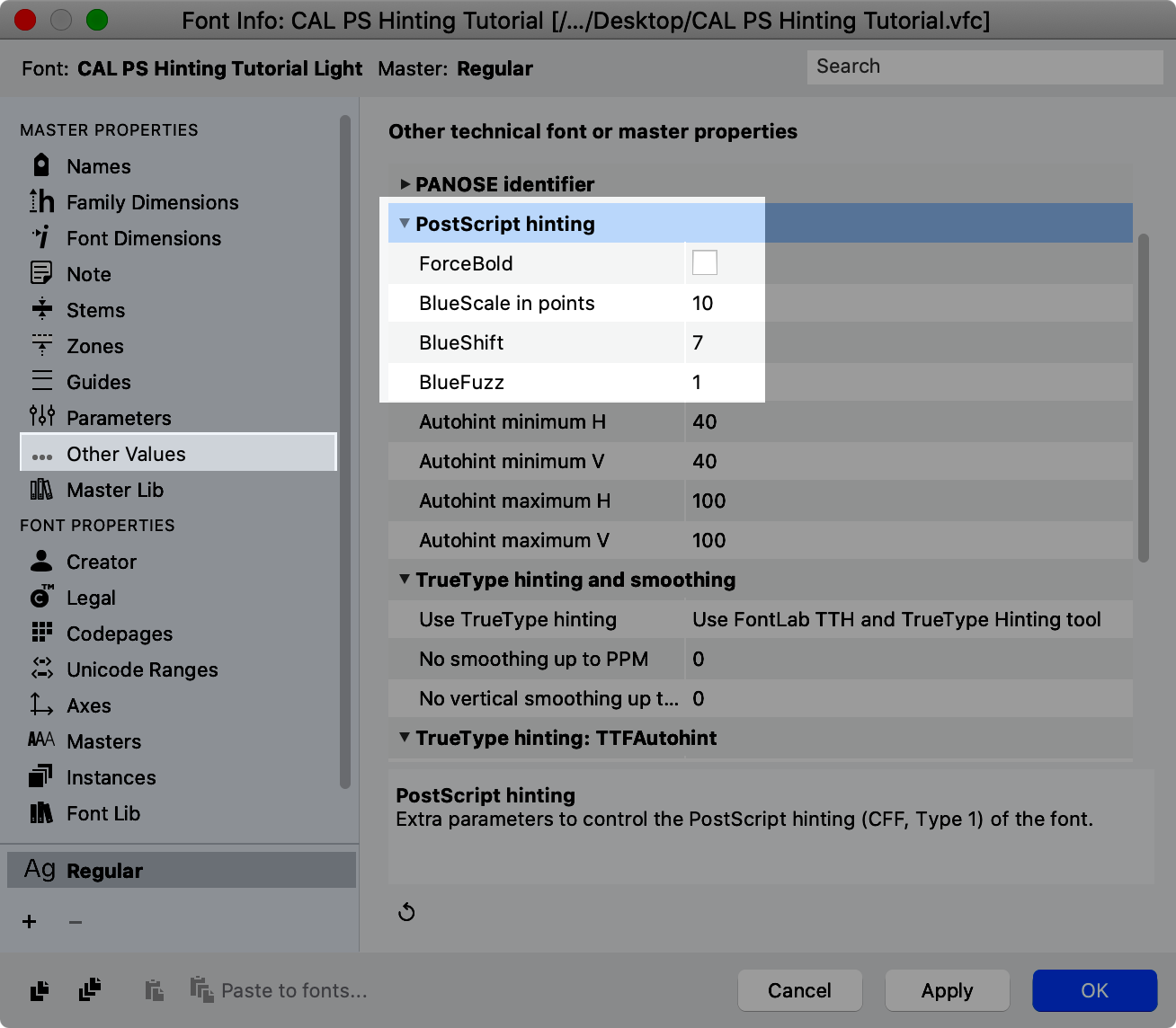
These little numbers represent important things.
Blue Fuzz
We’re start with the last first because this is the simplest.
BlueFuzz extends the zones like this.
The default value is 1. However, Adobes recommended value for this is 0.
There are exceptions to this rule.
If you are designing a fractional font, you don’t want an error of .2 units to impact your hinting! So, for your fractional fonts, you might want a BlueFuzz of 1.
Or…if you are not 100% sure of your overshoots and flats, leave your blue fuzz at 1.
Or else, increase the size of all your zones by 1.
BlueFuzz is an integer value.
BlueFuzz Changes Zone Distance
BlueFuzz also changes the minimum zone distance.
With BlueFuzz=0, the minimum zones distance is like this.▼
However, when a BlueFuzz of 1 is added, it increases the distance needed between zones, by one on each side.
Now meet the next blue.
Blue Scale
Before, you made zones to squeeze your overshoots.
But…at what point can the overshoots pop out?
Blue scale tells the renderer when to do this.
How Blue Scale Is Calculated
It is calculated in pixels. Devices with higher ppi (pixels per inch) will have overshoots at smaller sizes.
Lower resolution screens won’t get overshoots until much bigger sizes.
FontLab does the calculations for you. So you enter the blue scale in points on a 300 PPI device.
In general, you should type your values here as full point sizes, or simple decimals.
Good numbers: Point sizes ending in .0 .25, .5, .75. For example, 10, 10.25, 10.5, and 10.75.
Bad numbers: Numbers ending in .99, .24, .49, .74. That’s because this would destroy the automatic adjustment that the formula is making.
Technically…
BlueScale is technically calculated
BlueScale = (pointsize-0.49)÷240where the points size is for a 300-ppi device.The formula includes 0.49 is a built in adjuster. For example, a value of 10 points, becomes 9.51. This way the overshoot behavior changes at 9.51, a size not likely to be used. Instead of 9.5, a font size that is normally used.
FontLab’s calculations include this adjuster, so type in full point sizes, such as 10, 11, 12, etc.
Limits to BlueScale
Unfortunately, you can’t just enter ANY value for BlueScale.
That would just be too easy… wouldn’t it?
Use this calculator. Put your largest zone and it will tell you the max value that you can enter into the box.
Info
This uses a modified formula from the Type 1 Spec.
(pointsize−.049)×maximum alignment zone height<240pointsize−0.49<240/maximum alignment zone heightpointsize<240/maximum alignment zone height+.49Remember this is for 300ppi resolution.
Determining the Best BlueScale Value
On a PC, or using a program like InDesign, try changing your BlueScale Values to see what you like.
A little changes can make a big difference to a line of text.
You can use this calculator to figure out all your numbers.
Blue Shift
In some font designs you have smaller overshoots.
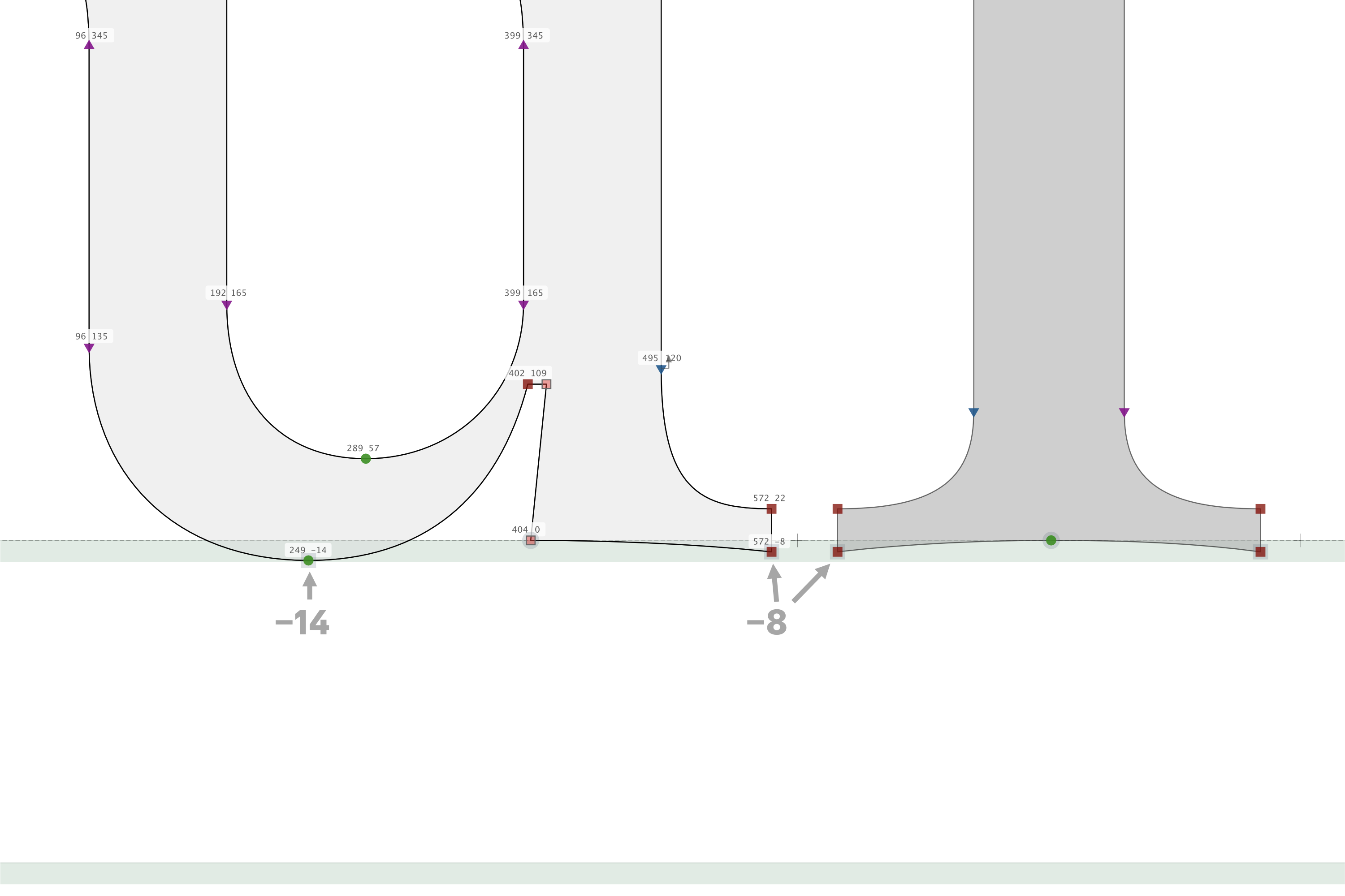
▲An example might be a u with cupped serifs (left). Or an I with cupped serifs.
Blue shift will make sure that the larger overshoot (−14) will be shown first, and the smaller overshoot (−8) will pop out later.
The above example shows the correct positioning of nodes.
In this case, our cups go down to −8. This is lower than the default value of 7!
So in this example, you would need to change the BlueShift value to 8.
Blue Family
Ok, so you know how bold and regular usually have different heights?
Well, if you don’t have family Blues, you might have a bold a pixel higher than the roman on the same line!
Not having blue values can make your text heights uneven.
Which font is your main font?
Usually it’s the regular weight upright. You want to copy those values into the family zones.
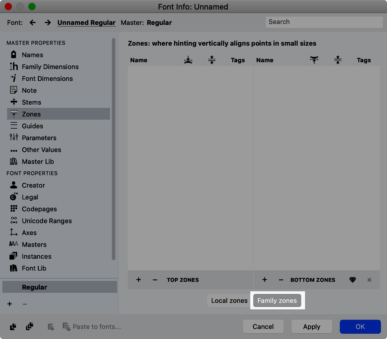
Manually type them over.
Almost done! Just the last settings to add the finishing touches.
AutoHinting Settings
Force Bold
Just for completeness, turn on force bold if you have a bold font and want it to still display as bold on either: 1) low res devices, or 2) very tiny font sizes.
I don’t know how this interpolates within a variable font, so I leave it off.
Hinting Export Settings
You can customize the exports.
Go to menu: File > Export Profiles…
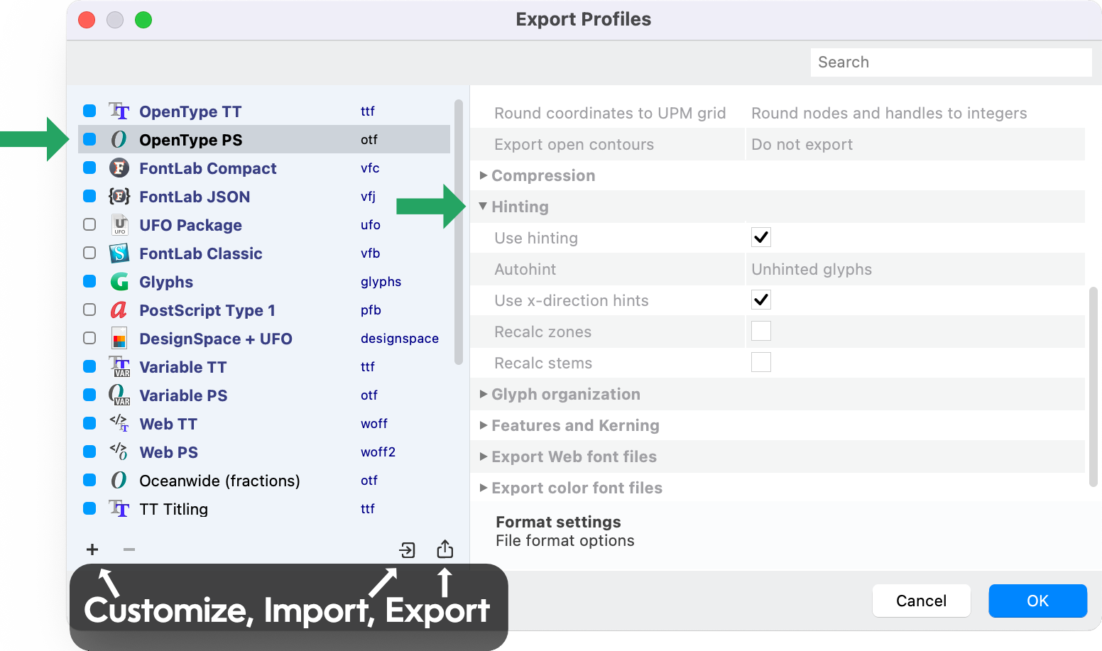
You can further tweak your hinting here. Obviously “use hinting” must be on. Usually, leave the recalcs off.
Preferences
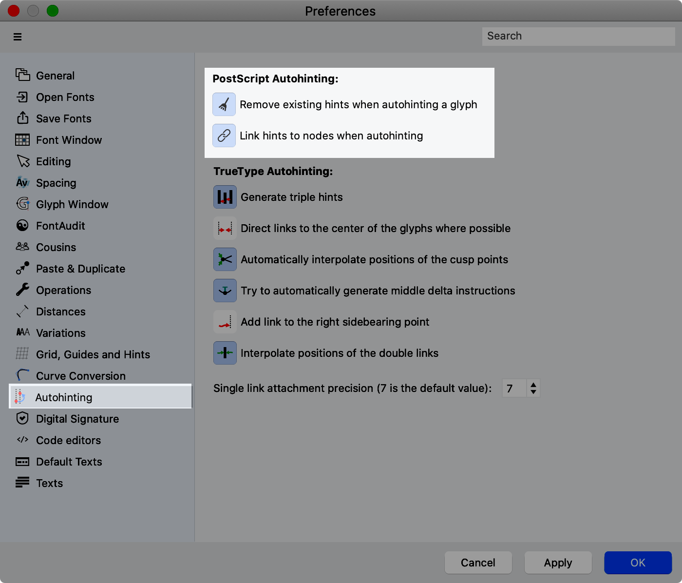
There are also two minor settings for autohinting in Preferences > Autohinting > PostScript Autohinting:
Good work!
You should have pretty good hinting. Make sure to check out all your characters in a waterfall.
At least for me, there’s always some character who’s dipping his terminal where it don’t belong.
Regards,