Briem’s notes on type design: Family likeness
Sometimes a few letters look awkward side by side, even if each seems all right on its own. Here are examples of four possible troublespots: serifs, weight, width and slant.
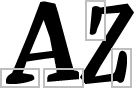
The serifs of these letters don’t look much like each other. They are crude. And the lumpy curves they are made of don’t match the straight lines in the rest of the lettershapes. Let’s use the serifs on the right side of the letter A as a basis for the others.
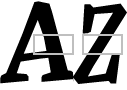
With the serifs in a better shape, we can continue. The letter Z is lighter than the letter A. We can either add weight to one or take it off the other. I suggest we add weight.
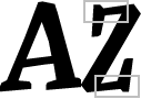
Now that the letter Z is bolder, we can see clearly that it is too narrow. Let’s widen it.
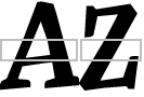
Pulling the horizontals wasn’t enough. Now we need to tilt the letter Z to the right. But the serifs should remain unchanged.
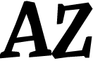
This is the end result. The serifs are uniform. The weight is even. The width matches. The slant is the same.
Light letter g
There are always exceptions. Here’s one. Compare the weight of these four letters from Franklin Gothic Condensed.

The letter g is lighter than the rest, as I’m sure you notice. Every stem and curve could have been made in the same weight as the rest. But a narrow letter g would then have very small counters. In a column of text, it would look too dense.
Shading
All the curves in the same design should look alike. This is not as easy as it sounds.

The shading, how the curves swell from thin to thick, is not the same in the letters n and o. But it looks the same. This example is from Bauer Bodoni. That’s the way to do it.
Notes on type design. Copyright © 1998, 2001, 2022 Gunnlaugur SE Briem. All rights reserved. Republished with permission in 2022 by Fontlab Ltd.