Briem’s notes on type design: Lower case
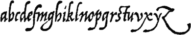
Arrigi’s lower case letters look lovely but irregular. The slant varies by about 10 degrees. The stems aren’t the same width. The ascenders are of different height. So are the descenders. What to use and what to reject is up to us.
Some of the letters were better suited to the sixteenth century than to our time. We’ll have to adapt and modify. The letter q looks too much like the letter g. The letter z would hardly blend into a column of text. If the letters f and g stood side by side, the descenders would get tangled up. (You think an f-g combination never occurs? Try “Afghanistan.”)
I’d like to keep some of the rough-hewn look, as I mentioned before. Taking straight lines and making them bumpy isn’t the best way to do it.
If only
Our original has plenty of variations. If time allowed, we could amuse ourselves with alternative characters.
Two ascenders with bent tops look better if the left is a little lower. A shorter alternative letter l would make the first half of a nice pair.
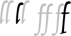
Two letters f side by side look more lively if they aren’t exactly the same. The sixteenth-century solution still looks good: a higher letter f with a straight descender on the right.
These two pairs always look good. Other alternatives could also be stuck in from time to time.


Arrighi used to end words with a terminal letter e. A few would make a page more lively.

A tied letter t that follows the letters c and s adds grace to the text. It has to be used sparingly, however. Seeing it used at every possible opportunity soon becomes tiresome.
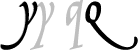
A nicely curved letter y and a letter q with a proper tail look great but get tangled with other descenders. They are best kept as alternative characters. Discerning users can fetch them when circumstances allow
This time, we’ll only make a basic set of lower case letters.
Notes on type design. Copyright © 1998, 2001, 2022 Gunnlaugur SE Briem. All rights reserved. Republished with permission in 2022 by Fontlab Ltd.