Briem’s notes on type design: Stems
Some things change when you tilt them.

Rotation: Stems at an angle can seem bolder than the vertical.

Slant: Stems at an angle are thinner than a vertical stem.
Should italic stems be the same thickness as the stems of the roman? Not necessarily.
The typefaces Frutiger and Neue Helvetica are worth studying for great attention to detail. When I measured upright and oblique stems, I didn’t see compensation for slant. Of course, obliques and italics are different creatures.
Density
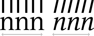
Italics are often more condensed than the roman. The stems are closer together. Here’s an example.

The stems of the roman on the left are farther apart than the stems of the italic on the right. If you want both to have the same density on a page, make the italic lighter. The stems of Galliard italic are 15% lighter than the roman. So they are in Stempel Garamond.
Notes on type design. Copyright © 1998, 2001, 2022 Gunnlaugur SE Briem. All rights reserved. Republished with permission in 2022 by Fontlab Ltd.