Briem’s notes on type design: Capitals two: rounded letters
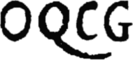
The rounded letters are more of a challenge than the straight stems. There’s more to decide. On its own, the letter O doesn’t tell us much. But next to the letters Q C G, we can probably conclude that all three are meant to be narrow.
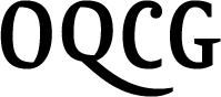
Here are the letters as I made them. We’ll go into that in some detail. The widest part of the curves slightly exceeds the straight stems, as I mentioned on the page about optical illusions.

Our grid needs three new parts. The first is a new template for the thickest part of curved capitals. Next to it, in the example in the left, is a template for straight cap stems, which we got earlier.
The second part of our grid is a template for the thickest part of horizontal curves in capitals. They need optical compensation.
The third part of our grid is a second baseline and a second cap line. The first was for straight lines, the second is for curves. They need optical compensation as well.
Notes on type design. Copyright © 1998, 2001, 2022 Gunnlaugur SE Briem. All rights reserved. Republished with permission in 2022 by Fontlab Ltd.