Common Axes
Benefits Feel confident, knowing the options for your family.
For all practical purposes, FontLab allows infinite axes and infinite masters.
Yes!
You can make any family you want!
Also, FontLab allows you as many custom axes as you want!
If you are not a programmer by nature, this allows you to do so many things. Things that would be otherwise impossible!!
In this tutorial, I will show you the basic axes, then I will show you how to set them up.
Axis definitions
Weight Axis (wght)
Sans Weight
When you design a weight axis, you label each master with the weight.
I use the weight of the lowercase i.
For the above master, the hairline would be labeled two and the ExtraBlack (Really XXBlack) would be labeled 400.
However, when you export it for the user, it’s an entirely different set of numbers.
We’ll talk about this more in the tutorial about weights. I’ll show you how to change your weights into what the user will see.
Sans Problems
Sans is just a bunch of rectangles, right?
Well…
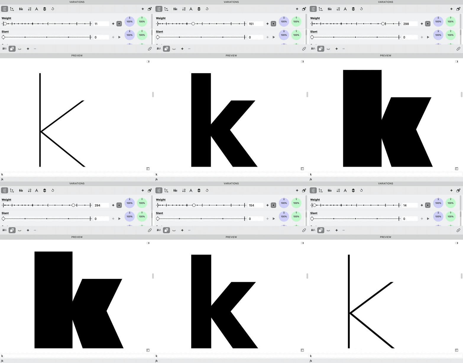
Take the above masters at 2 and 400. Then just mix them. You get this:
Download VFJ
Why does the hairline and XXBlack mix like that?
Well, the different strokes are changing at different rates.
You can fix this using “glyph masters” (intermediate masters).
Check out this E in the file.
Here’s Google’s axis definition:
*Axis Definition (User settings.)*
*Weight*
*wght*

*Default: 400*
*Min: 1*
*Max: 1000*
*Step: 1*
*Adjust the style from lighter to bolder in typographic color, by varying stroke thicknesses or other forms. This typically changes overall width, and so may be used in conjunction with axes for Width and Grade (if present).*
Here’s how FontLab labels each weight. (Remember this is what the user sees.)
| Weight | User Value |
|---|---|
| Hairline | 1 (not official) |
| Thin | 100 |
| Extra Light | 200 |
| Light | 300 |
| Regular | 400 |
| News | 450 (not official) |
| Medium | 500 |
| Semibold | 600 |
| Bold | 700 |
| Extra Bold | 800 |
| Heavy | 850 (not official) |
| Black | 900 |
| Extra Black | 950 (not official) |
Serif Weight
With serifs, there are two primary methods of weight gain.▼
In general, Modern Styles gain weight like this. Sometimes Transitionals.
The other method of weight gain gives quite different results▼
Alegreya shown
Here, weight is added everywhere. However, the verticals still gain more weight than horizontals.
Slabs gain weight like this.
Old styles tend to gain weight all around.
Good question
So, why do old styles tend to gain weight all around? It’s discussed in the section on weight gain. Also in that section, you’ll discover many methods for weight gain and weight loss. And you can do it all without exercise and gimmicky milkshakes!
Here’s the play button in the Variations Panel to check your mix.▼
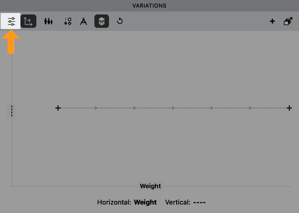
If you don’t see these slider, click into the upper left slider button.
Width Axis (wdth)
Sans Width
You might notice in the first d that the structure does have to change when you go from XXXCondensed to wide.
Condensed widths are more often used. Wides are common, but not as desired as the condenseds.
Ultra condensed are sometimes called screamers!
YES!
haha
Serif Width
Modern Style serifs have vertical emphasis. So, it’s easier to add a width.
Sometimes Transitionals. Or also non-standard styles.
Take for example this Transitional, condensed text face by Pierre Simon Fournier.
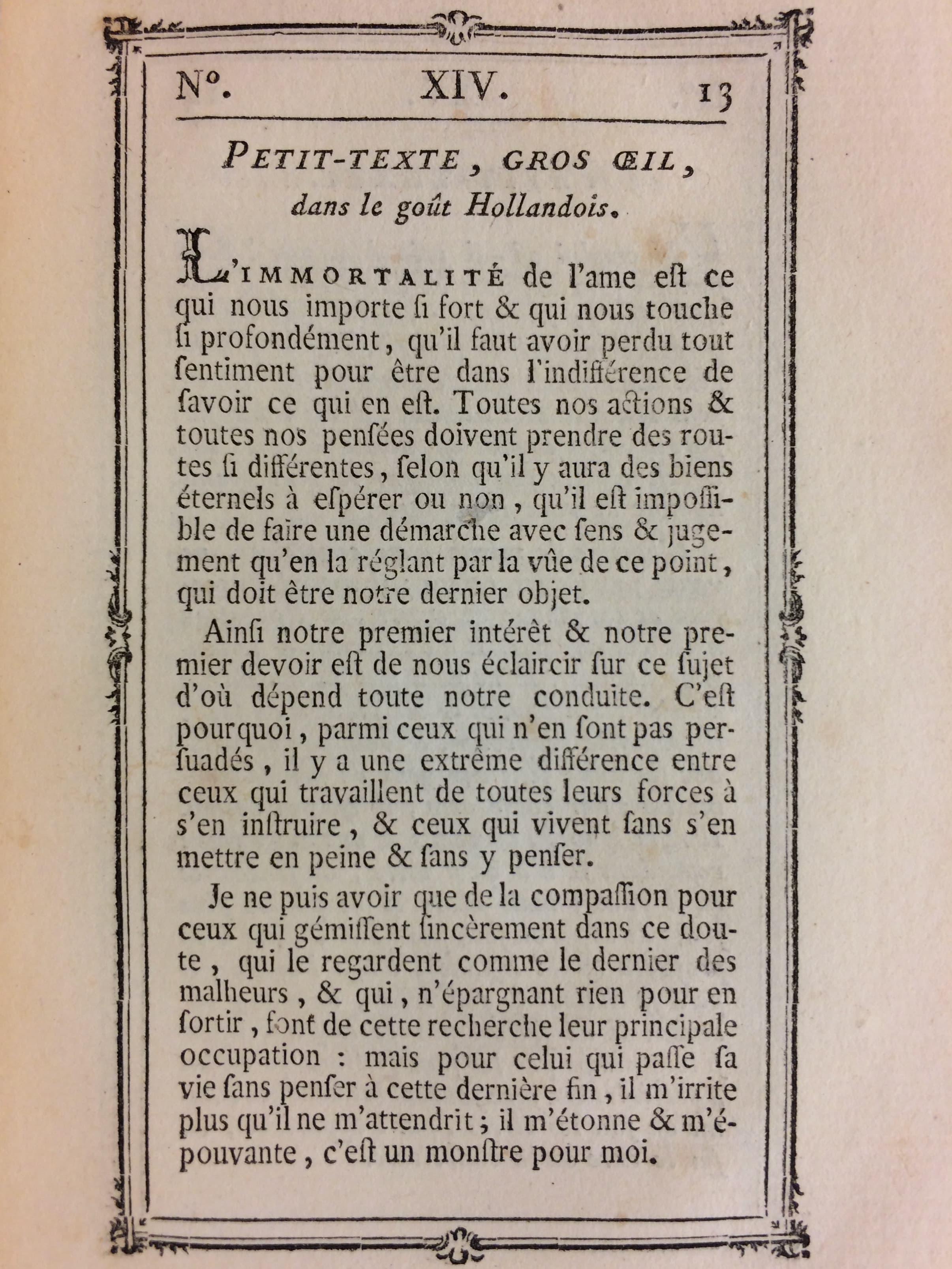
It’s more difficult to add or subtract width from oldstyle faces. This is because of the angle of stroke.
However, it might even make sense to add slight width adjustment, even to old styles.
Maybe that will help your customer fit more words on a page?
*Axis Definition*
*Width*
*wdth*

*Default: 100*
*Min: 25*
*Max: 200*
*Step: 0.1*
*Adjust the style from narrower to wider, by varying the proportions of counters, stems, and other forms including overall spacinig and kerning. This typically changes the apparent weight (what typographers call 'typographic color') in a subtle way, and so may be used in conjunction with axes for Width and Grade (if present).*
Info
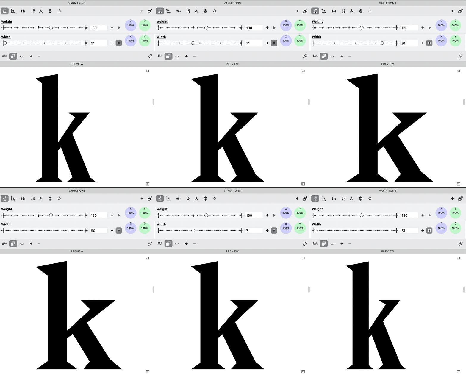
These values seem to be the % of stretching. However 50 on the scale doesn’t need to be actually 50% of the width. You use your eye. You will learn more about common numbers in the width Axis section.
Here’s an example mix going from 50 to 100.
Download VFJ
Check it out in this file:
Optical Size Axis (opsz)
Sans Optical Size
This is not commonly used for sans, although it could benefit sans’s at very large or small sizes.
Serif Optical Size
Optical sizes don’t seem so valuable, because the online retailers present optical sizes as above.▲
However, what if you put the letters into the correct sizes?
This representation is closer to the truth.▼
The above is a Bodoni modern style serif.
Optical sizes are necessary for these modern styles. (Otherwise the serifs will disappear at low sizes.)
Some people say old styles shouldn’t have an optical axis.
However, even old styles had optical sizes. That’s because the engravers just naturally carved fonts to be delicate at large sizes.
‘De Tournes’ Ten-line Pica Roman, possibly by Granjon. (Vervliet p. 240)▼
Not to mention large inscriptional caps made at that time!
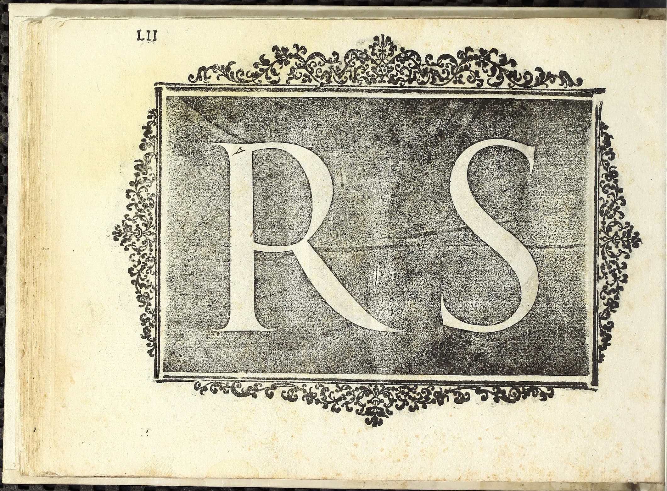
Here’s an inscription model from the 1500s by Giovanni Cresci.
*Axis Definition*
*Optical Size*
*opsz*

*Default: 14*
*Min: 6*
*Max: 144*
*Step: 0.1*
*Adapt the style to specific text sizes, specified in Points. At smaller sizes, letters typically become optimized for more legibility, with loose spacing/kerning and thicker strokes with less detail. At larger sizes, letters are typically optimized for headlines with thinner strokes and more detailed forms, and more extreme weights and widths. When used in CSS, this axis is activated by default, but not all products/platforms use it automatically.*
Info
As a recent feature, InDesign has an option to automatically size a variable font using the optical size!! Meaning, when a user changes the font size to 72, InDesign will automatically change the opsz slider to 72!
Example mix, 2 masters.▼
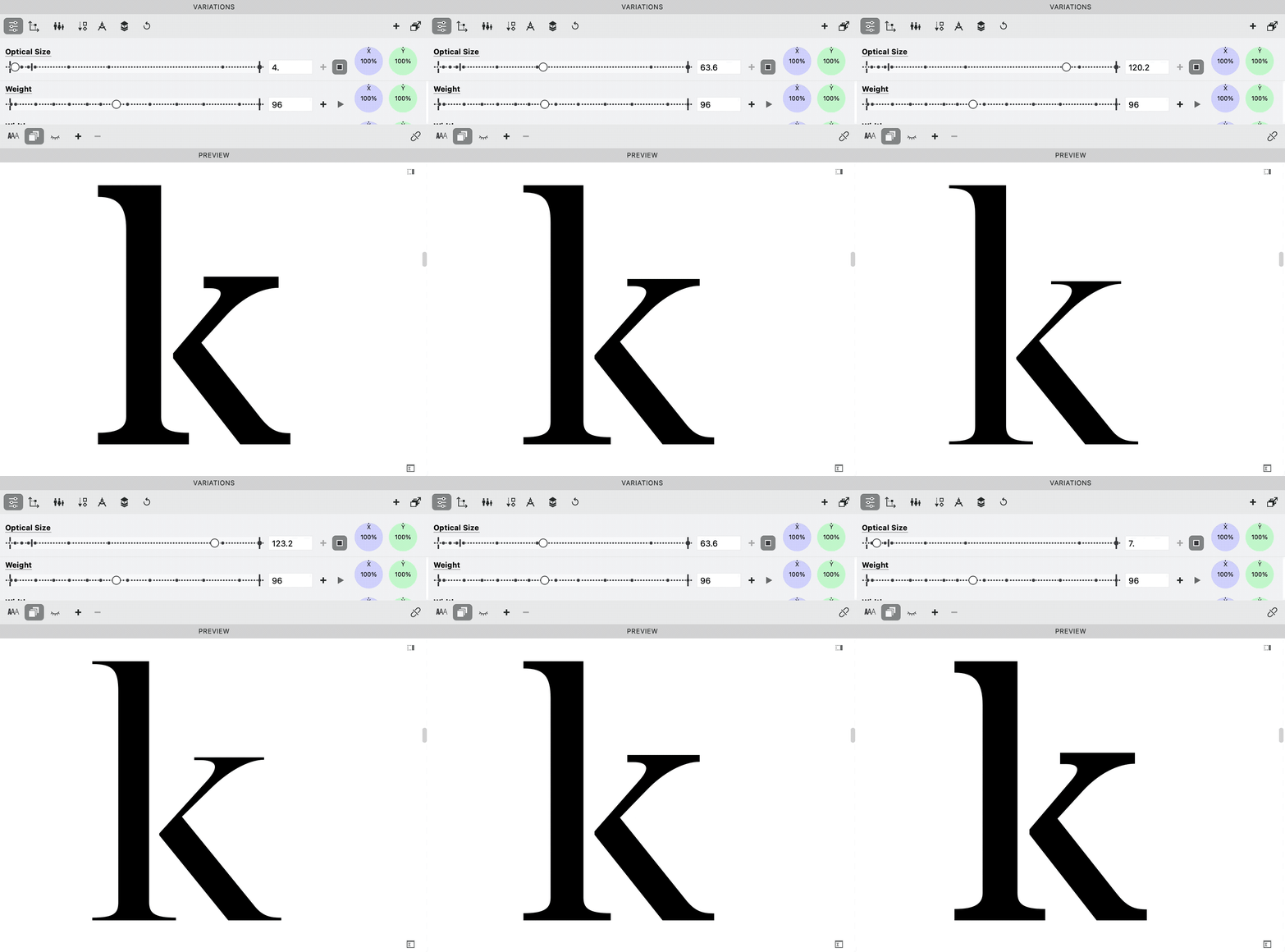
But remember this is not quite right?
Something like this would be truer.▼
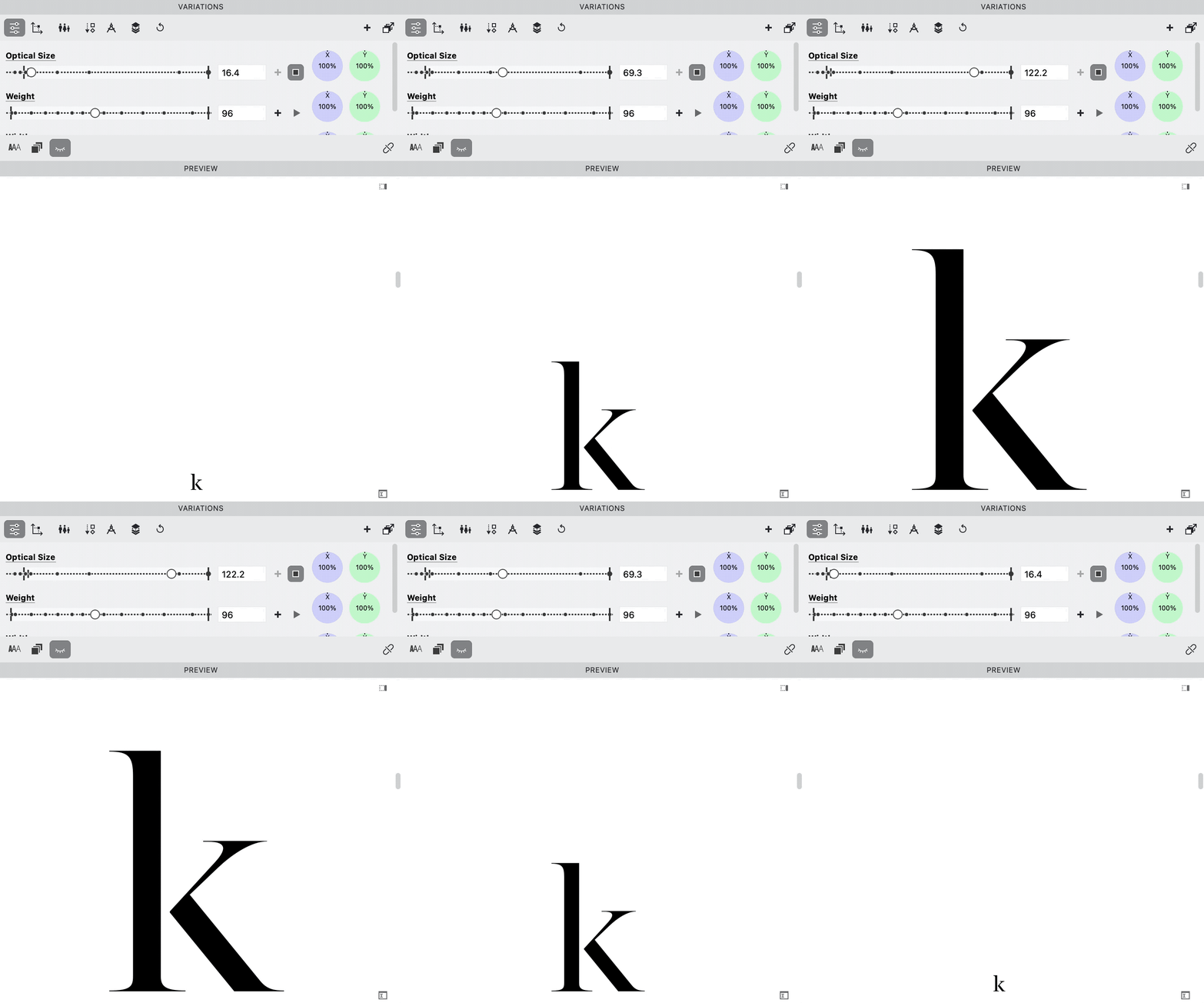
It’s the same thing, but linearly resized. (Which you’ll see is not all the way good!)
Slant Axis (slnt)
Sans Slant
An extreme slant of −32° to 32°. (The strokes have been corrected.)
Serif Slant
As we’ve seen slanted romans are rare.
*Axis Definition*  @ is this Google definition?
*Default: 0*
*Min: -90*
*Max: 90*
*Step: 1*
*Adjust the style from upright to slanted, also known to typographers as an 'oblique' style. Rarely, slant can work in the other direction, called a 'backslanted' or 'reverse oblique' style.*
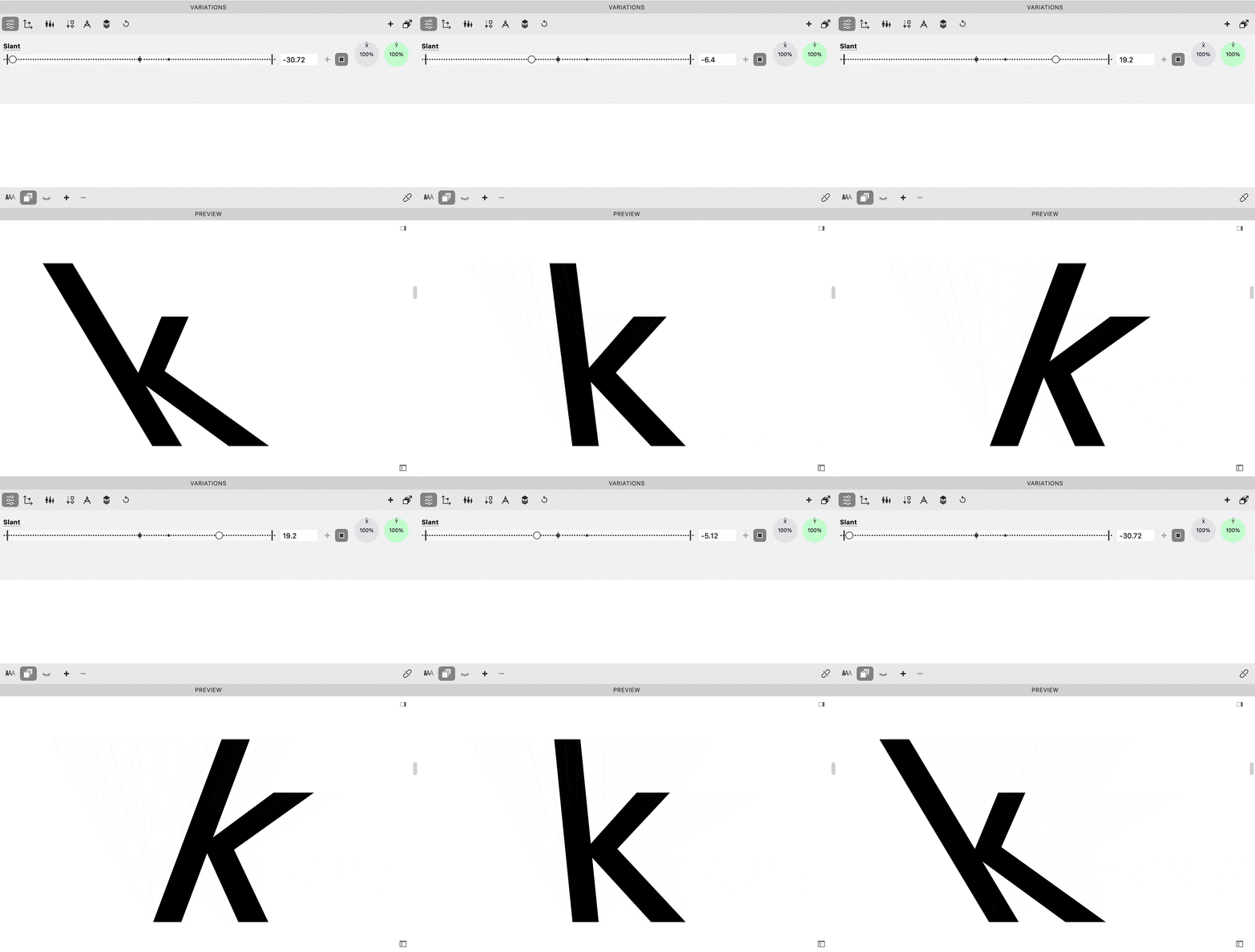
Creating a slant axis is difficult because of the possible kinks you can get in the interpolation!
See the section on drawing for interpolation.
You have to correct the letters in a bunch of weird ways in order to make them look halfway decent.▼
Download VFJ
Here’s a file to try it out!
We are done!!
Well….
Not really.
There are many more axes to try! It’s like being a kid in a candy store.
Cheers!
- Font Definitions taken from Google Variable fonts Axis definitions.