Briem’s notes on type design: Curve compensation
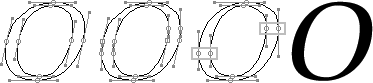
Slanting a curve bends it out of shape. On the left side the bulge lands too low and too high on the right. Here are three examples of the same letter.

The first of the italic letters slants 7.5 degrees, the second 12.5 degrees, and the three 17.5 degrees. The greater the slant, the higher the bend is on the curve.

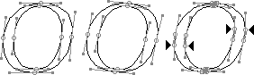
The curves of these three slanted letters have been adjusted, and look all the better for it. The bend of the curve is lower. Here’s one way of mending a 12.5-degree slant.
- Slant it 12.5 degrees. The points on the sides will no longer be on the outemost edges of the curves.
- Add new extrema points. This gives you two sets of points close to each other.
- You won’t need the tilting extreme points you had at in the beginning. Remove them. No doubt you notice that the remaining points on either side are too low and too high. We’ll come back to them in a moment.

- Slant it 6.25 degrees, half of the 12.5-degrees you’re working on.
- Rotate it 6.25 degrees, the other half of the full slant.
- Add new extrema points. We need the coordinates.
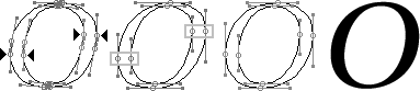
- Take the height coordinates of the new extrema points of the letter that we both tilted and rotated.
- Then fetch the letter that we slanted 12.5 degrees and gave new extremas.
- Slide the points of the new extremas to match the height coordinates. It’s a piece of cake. Really. But if you slant a lot, such as the 17.5 degrees we looked at, you may have to make final adjustments of the curve by eye.
Curve compensation is less work than you think. Once you’ve done the letter O, you’ve got the letters C D G Q as well. Mend the letter P, and you’ve got the letters B R.
Notes on type design. Copyright © 1998, 2001, 2022 Gunnlaugur SE Briem. All rights reserved. Republished with permission in 2022 by Fontlab Ltd.