Briem’s notes on type design: Make a grid
In most type designs the same shapes are repeated many times. We won’t need many of those. And ours are simpler than most.
Start by counting horizontals
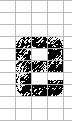
We’ll need ten in all. Let’s start by roughing out the letter e.
![]()
The letter e spans five horizontals: three for the black lettershapes, and two for white counterspaces. This takes care of letters within the x-height. You’ll need at least another five to define the rest.
![]()
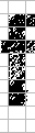
The ascender of the letter f takes two horizontals, one for the lettershape and another for the counterspace. That takes us to seven in all.
![]()
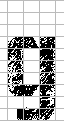
For the descender of the letter g, add two more horizonals below the baseline. One is for the lettershape, the other for the white counterspace.
![]()
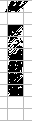
We’ll have to allow two horizontals for the accents. And that assumes that the capitals are one horizontal lower than the ascenders. This makes ten in all.
Set up a grid
Verticals and horizontals in the proportion of 3:4 are useful. The stems are 128 points wide, the horizontals 96 points high. But if you prefer other dimensions, you can work with them as well.

Some numbers are easier than others. I like the kind that can be halved several times. Fifty, for instance, is not a good choice. The first time you divide it by two, you get 25. Halve that, and you run into fractions. Instead, I prefer 48, which can be halved four times.

An example
Using the grid, the letter i looks like this. The x-height takes five horizontals, the dot and the gap two.
Notes on type design. Copyright © 1998, 2001, 2022 Gunnlaugur SE Briem. All rights reserved. Republished with permission in 2022 by Fontlab Ltd.