Briem’s notes on type design: More rounded letters
You can do what you like when you play with lettershapes. Nobody will call the cops.

The top end of Arrighi’s letter C is a blob. We could safely use the serif from the letter G. Instead I decided on a whimsical solution. But ordinary, practical solutions are better in the long run.
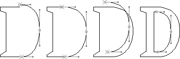
You can make the letter D from half a letter O and a stem. First you put the curve on the baseline and reduce it to the cap height.
Next you stretch it to the width you want.
Then you make a copy of the curve for the countershape. Put the lower end at the height of the lowest bar in the letter E.
Finally reduce the height of the curve. Give it the height of the underside of the top bar in the letter E. The width between the inside and the outside curve should be the same as in the letter O. And widen the curve until you get a shape you like.
Here is the rest of Arrighi’s curved capitals. They give us proportions of height and width, and some idea of his intentions.
For more details about Roman capitals, look at Origin of the Serif by Edward M Catich (great illustrations, unreliable text.) For Renaissance caps, Giovanni Francesco Cresci’s book Renaissance Alphabet is a good start.
We have defined a curve, a stem and some serifs. We’ll manage. Here’s a way of making the letter P from the letter D.
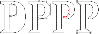
First reduce the inner curve of the bowl. Next reduce the outer curve. This is almost enough.
Then adjust the inner curve. And finally you change the serifs and close the path.
Use the same curve where you can. It strengthens family resemblance among related characters. And it can save you work.

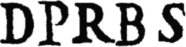
The letters D and P didn’t make great demands. This version of the letter R has a shorter diagonal than the original. This makes spacing easier.
The letter B is made much like the letters D and P. The waist is the same height as the middle bar in the letter E. The letter S we’ll talk about on the next page.

The letter U introduces a new template to our grid, the narrow stem. It’s about the thickness of the bar in the letter E. You’ll put it to use in the diagonal letters. You make the bottom from the letter O. You risk a couple of pitfalls. One extreme is a deep, narrow curve. Another looks like like a punctured tire. Look for a middle way.

Arrighi shows neither the letter U nor J. Both were latecomers to the Latin alphabet. The letter J ends in a shape that is typical of the lower case letters. When we have taken a look at them, we can add it.
Notes on type design. Copyright © 1998, 2001, 2022 Gunnlaugur SE Briem. All rights reserved. Republished with permission in 2022 by Fontlab Ltd.