Briem’s notes on type design: The b-group
We need another triangular bowl for the b-group. Turn the bowl from the a-group upside-down if you like. It looks better balanced if you tilt it three or four degrees to the left. And giving it a higher counterspace helps as well.

You can make the letter b from the b-bowl and the letter l (first remove the exit stroke). I suggest you straighten slightly the left side of the letter l.
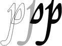
The letter p can be made from the b-bowl and the letter l upside-down. The descender needs work. I suggest that you make it narrower at the bottom curve. Deepen the curve on the left side and move it to the right.
The entry stroke also needs work. I suggest you use the entry stroke from the letter n when you have defined it. For hundreds of years, the stem of the letter p was a little higher than other similar stems. As a nod to tradition, I gave it a pull.

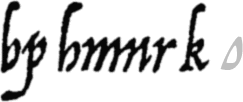
Arrighi’s letter h was not meant to be connected to the following letter; didn’t even have an exit stroke. Make it from the letter b. You can finish the second stem in a much the same way as you finished the descender of the letter p.
If you prefer, you can make the letter h from the letters b and n. It’s fine, too.

Assembling the letter n calls for attention to detail. You can get the exit stroke from the letters i or l. The b-bowl gives you the thin, diagonal upstroke and the upper part of the countershape. But slant it back to the right the same three or four degrees you slanted it to the left before.
I’d like you to give the entry stroke a different angle from the exit stroke, a little flatter. It makes the letter more interesting. Then you can remove the overlaps and join the ends.
We left the letter u unfinished. Now you can put the entry stroke in its place.

You can base the letter r on the letter n. It needs a thicker oblique. I advise you to add most of the weight on the upper side. Don’t let the letter stretch too far to the right. Remember the you have to space it.

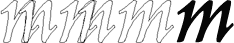
The letter n is obviously starting point for the letter m. You can remove the overlaps, join the ends, and move on.
I added a little irregularity by slanting it a bit more than the letter n. I also made the two counters at the bottom less uneven in size.

Straight lines are useful for sketching out a shape.
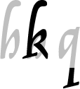
In the papal chancery at the turn of the sixteenth century, the letter k was rarely needed. It was the only lower-case letter that Arrighi gave a serif, and I’d like to keep it. This doesn’t leave much room for an exit stroke, which I think we can safely leave out.
If we use the letter h as a starting point, we have to lift the thin, oblique upstroke to make room for the middle part. I also made it thicker, to make sure the letter wouldn’t come apart in the middle.
You may well have to work on the small bowl for a while before you’re satisfied with it. It’s a tricky shape. Try working with straight line segments first. Then add curves.
Modern readers would probably misread Arrighi’s letter q for the letter g, as I mentioned. I suggest you use the serif from the letter k at the end of a straight descender.
Notes on type design. Copyright © 1998, 2001, 2022 Gunnlaugur SE Briem. All rights reserved. Republished with permission in 2022 by Fontlab Ltd.