Briem’s notes on type design: Capitals one: straight stems
Here are the letters I and H from La Operina. They give us less information than I’d like.
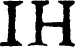
In his time Ugo da Carpi was probably the best woodcutter that money could buy. But I don’t expect to enlarge his letters 800% and get a perfect scan almost five centuries later .
The stems couldn’t all have been cut to exactly the same width. And ink squash has no doubt made them bolder in places. Worn plates can’t have helped. We have to decide the stem width on our own.
The bar in the letter H is thicker at one end than the other. We’ll have to use our own judgment there, too. The bar is lower than you’d expect in Renaissance capitals. We’ll lift it very slightly. The serifs are uneven, but something can be made of that.

Here are the beginnings of a grid. We have two horizontal lines, the capital line and the baseline. We also have a template for a horizontal bar and another for capital stems. I mentioed this earlier on the page about framework.
The digitized letters on the right both have the same stems. The bar in the letter H is thicker at one end. The serifs are irregular on an even baseline. More about that on the next page.
With a stem, a bar, and a start on serifs, we can attempt the letters L T E F next.

We’ll put the middle bar of the letter E is slightly higher than the lower bar of the letter F. That’s how it should be. The letter L is much like the letter E with parts missing. Our letter T is narrower than the original, and the top serifs shorter. This is closer to a family likeness and allows tighter spacing.
The letters haven’t got a single curve between them, which is yet another arbitrary decision. But some roughness is not out of place, I think, in a design based on small woodcuts.
Notes on type design. Copyright © 1998, 2001, 2022 Gunnlaugur SE Briem. All rights reserved. Republished with permission in 2022 by Fontlab Ltd.