Briem’s notes on type design: The letter s
Some people hate making a bold letter s from the regular weight. Here’s a way of doing it without much pain.
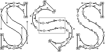
The letter s on the left is properly digitized with ten curve points and eight corner points. Let’s begin with that.
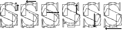
First you rotate the letter 45 degrees. We need four more points. Add them at the high and low points of the spine. I have put a rectangle around them to remove all doubt.
Next rotate it back. Once this is done we’re ready for some scaffolding.
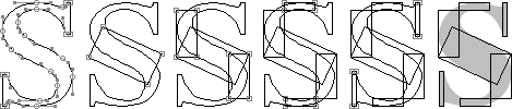
Our bold letter s will be a fifth wider than the regular weight.
- Give it a 20% sideways stretch. This will add about five degreees to the slant of the spine.
- Stick in a template for the new spine. It should be at least as thick as the letter l, with a tilt of about 65-degrees.
- Define the curves on both sides. Here the width of the rectangles should be about two-thirds of the thickness of the spine. This proportion is a matter of taste. It also depends on what type style you’re working on.
- Decide the thickness at the top and bottom curves. Ours are a fifth thicker.
- Define the serifs. Making them longer is one way of adding weight. One-tenth longer is a safe bet.
- With seven templates, we’ve got plenty of support to hang the curves on. Remove the stretched letter S.
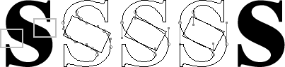
- Stick a copy of the letter s in regular weight into the template scaffolding. Let’s do the left side first.
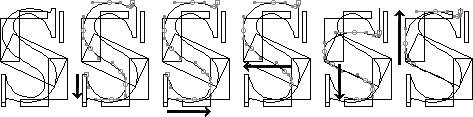
- Our starting point is the right side of the lower serif. At the other end is the left side of the top serif. Select every segment between the two. Keep the starting point immobile and stretch the selection until the bottom curve overlaps the top of the bottom template. This method is useful. Make sure you get a grip on it. As you pull and squeeze, the curve may fly about like a bullwhip. That’s to be expected if the proportions are the same as when you started.
- Our starting point is still the right side of the lower serif. Keep it immobile and stretch the selected path sideways until the right curve overlaps the left side of the right template.
- Deselect the two bottom segments from the curved path. Our starting point is now the right side of the bottom curve, which overlaps the right template. Keep it immobile. Stretch the selected path sideways until the left curve overlaps the right side of the left template.
- Reselect the right bottom segment of the curve. This makes our starting point the bottom of the curve. The other end is still the left side of the top serif. Keep the starting point immobile. Squeeze the selected path downwards. We added new points at the outset, remember? When the upper of the two (on the left of the blunt end of the arrow) overlaps the template, we have squeezed enough.
- Deselect everything below the overlapping point. It will be our new starting point. Keep it immobile. Stretch the selected path upwards until the top point overlaps the top of the top template.
Don’t worry. This is not nearly as complicated as is sounds.
All that’s left to do with the left side is to adjust the serif. The top point on the curve will be our immobile starting point. We stretch sideways to give the serif the right thickness. We stretch downwards to get the curve right.
- On the right side, our starting point is the left side of the upper serif. At the other end is the right side of the bottom serif. Select every segment between the two. Keep the starting point immobile and stretch the selection until the top curve overlaps the bottom of the top template.
- The starting point is still the left side of the upper serif. Keep it immobile and stretch the selected path sideways until the left curve overlaps the right side of the left template.
- Deselect the two top segments from the curved path. Our starting point is now the right side of the top curve, which overlaps the left template. Keep it immobile. Stretch the selected path sideways until the right curve overlaps the left side of the right template.
- Reselect the left top segment of the curve. This makes our starting point the top of the curve. The other end is still the right side of the bottom serif. Keep the starting point immobile. Squeeze the selected path downwards. When the lower of the two points we added at the outset (on the right of the blunt end of the arrow) overlaps the template, we have squeezed enough.
- Deselect everything above the overlapping point. It will be our new starting point. Keep it immobile. Stretch the selected path down until the bottom point overlaps the bottom of the bottom template. Then adjust the serif.
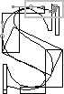
Your letter now has a spine with two nasty bumps. They’ll have to go.
First select the four points that we added at the outset. Next you delete them. Then you adjust the curve to the template, and you’ve got a respectable bold letter s.
Is this clear enough? Tell me how far we got before I lost you.
Notes on type design. Copyright © 1998, 2001, 2022 Gunnlaugur SE Briem. All rights reserved. Republished with permission in 2022 by Fontlab Ltd.