Briem’s notes on type design: Autotracing tips
If you decide to autotrace, even if you know the angels will weep for you, remember these four tips.
One. Use large scans for tracing
The difference between the bad and the indefensible may be a matter of detail. High resolution can help.
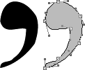
This comma was autotraced from a small scan (82 pixels in height). It looks terrible.
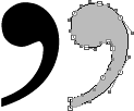
This comma was autotraced from a larger original. The scan was 333 pixels high. Although the points landed in odd places, the shape itself is better.
Two. Put in minimum/maximum points
You should have a Bézier endpoint where curves extend most: at the top and bottom, farthest to the right and left. Some people call these points extremas.
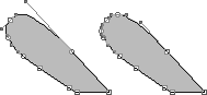
The acute accent on the left hasn’t got minimum/maximum points. The right one has.
Should you add more points to a path that has more than enough already? Sometimes. The accent on the left, as I’m sure you noticed, has control points (“handles”) sticking out all over the place. They can be a menace. After you’ve added minimum/maximum points, in the example on the right, the length of the handles is more manageable.
Three. Tidy up your outlines
Get rid of points that you don’t need. Many don’t define the shape. Some make it worse.
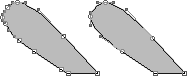
The acute accent on the left is defined with ten endpoints. The right one manages with six.
Four. Pay attention to overlaps
When one shape goes across another, autotracing often runs into trouble.

The original image, on the left, has sharp corners where the shapes cross each other. The autotrace on the right created bad curves.
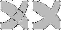
Where the corners must be sharp, you can make a separate outline for each shape, and then remove the overlap.
Notes on type design. Copyright © 1998, 2001, 2022 Gunnlaugur SE Briem. All rights reserved. Republished with permission in 2022 by Fontlab Ltd.