Briem’s notes on type design: Limitations
Some things just don’t work
Some obstacles are easier to bypass than to overcome, and there’s plenty of them. We ignore the traditions of typography at our peril. Computers and printers still have a few surprises left.
Find the limits of what can be done, and do your best within them. Here are two examples. One is the trouble with low resolution. The other is the limit to bold type, which we’ll look at first.

Limits to boldness
In a monospaced typeface (and on most typewriters) every character is given the same width. This restricts how bold you can make the design. The letter o may look all right. But with shapes of the same thickness, the letters a and e become very dense. And the a-e ligature is too bold and squeezed to belong with the others.
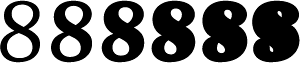
In very bold numerals, the white counter space can become too small. This can lead to other trouble.
Numerals that are used in tables should all have the same width. Otherwise the columns look disgraceful. Light and bold should have the same width, too, if they are used together. Add to this that numerals must not be much lighter than the lower case, which in turn restricts everything else. When you sketch out an ultrabold typeface, you should therefore include the numeral 8 in your first draft.
Low resolution
The computer divides letters into dots on a grid. It makes some shapes without any trouble. Others get a thrashing.

In low resolution, even in grayscale, the subtleties of Hermann Zapf’s Optima suffer.

The same sample of Optima looks even worse as a black-and-white bitmap. Of course, tapering stems still have their place. You should know what problems they involve. Then you can take them into account from the outset.
Against the grain
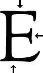
The subtle curves of the letter E in Goudy Old Style don’t sit well on a grid. Each arrow points at a gap in a row of pixels. Even in grayscale, they are a sorry sight.
In hot-metal printing and phototypesetting, these shapes are of no consequence. But computer output in low-resolution has shortcomings of its own.

This letter E has straight horizontals and verticals. (I’m not sure if Frederic Goudy would have approved.) It takes into account the properties of a coarse grid.

Fragile hairlines
The numeral zero on the left has a thin hairline at the bottom. It’s not much but it’s enough: it survives in small sizes. The hairline at the top, on the other hand, is too thin. It falls to bits when you reduce it, as you see in the small zero in the middle.
On the right is the small zero enlarged. You can see the difference. The bottom is strong enough. The top isn’t.
You have a choice of working within your limits or overcoming them. Which works best each time is for you to decide.
Notes on type design. Copyright © 1998, 2001, 2022 Gunnlaugur SE Briem. All rights reserved. Republished with permission in 2022 by Fontlab Ltd.