Briem’s notes on type design: x-height
Don’t take x-height for granted.
Italic letterforms are usually closer to handwriting than roman letterforms. Pointed shapes and curved that seem to be the same height often are not.You may well need one midline for your roman and another for the italic.
There are no rules. The italic of Times New Roman has a lower midline than the roman. It is higher in the Palatino italic. Testing a few variants is worth the effort.
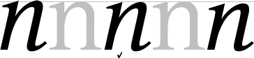
The three italic letters in this example are are of diferent height.
The letter on the left is 2% higher than the roman and looks it. The middle letter is 2% lower than the roman. That’s about right for this design. The letter on the right is 4% lower than the roman; too short.
Trust your eyes. Measure afterwards.
Notes on type design. Copyright © 1998, 2001, 2022 Gunnlaugur SE Briem. All rights reserved. Republished with permission in 2022 by Fontlab Ltd.