Fixing Paths by Hand
Benefits Basics & tricks to take a drawing from messy to enjoyable, sparkling shapes.
Fixing paths by hand is about being good with your tools.
You might do about 95% of your hand-refining using the Contour (white arrow) tool.
Really, it’s FontLab’s Swiss army knife.
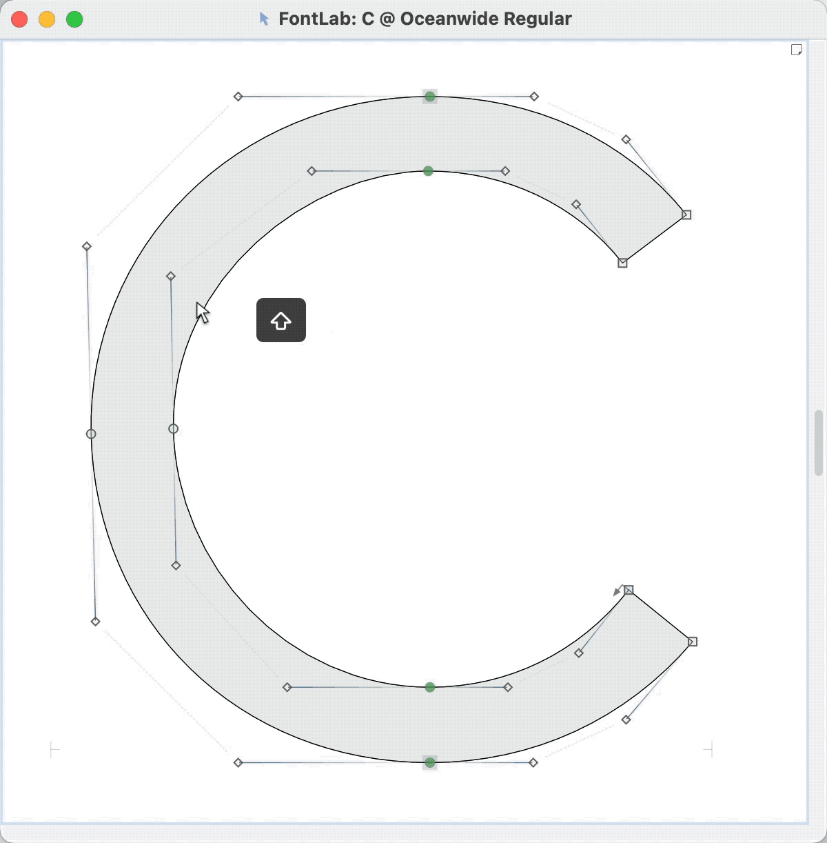
Tip #1: Shift ⇧ Is Your Friend
Ummm, excuse me…
Your node is showing.
STRAIGHTEN UP YOUR NODES!!
Remember the nodes at extremes rule? Curves need nodes at extremes.

Shift solves that problem.
There’s a lot of ways that you can use Shift to align things. But, right now, I’m just going to recommend that you hold Shift and double click handles (yellow nodes).
That’s it!
Shift straightens.
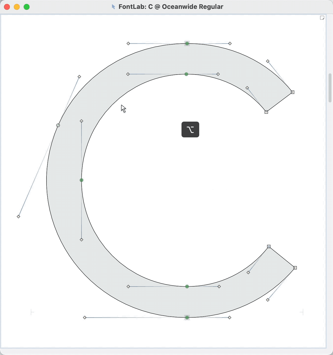
Tip #2: Option ⌥ Is Your Friend
Alt Slides
Alt slides things around.
I’m going to show you two operations..
Remember how we Shift-double-clicked the handle to make it straight?
Well maybe other times you have a situation like this.▼

Well, you can’t use Shift-double-click that. You’d get something gosh awful. ▼

So you use Alt-double-click. Almost the same, just remember that it’s Alt instead of Shift when you want it to slide to the extreme.
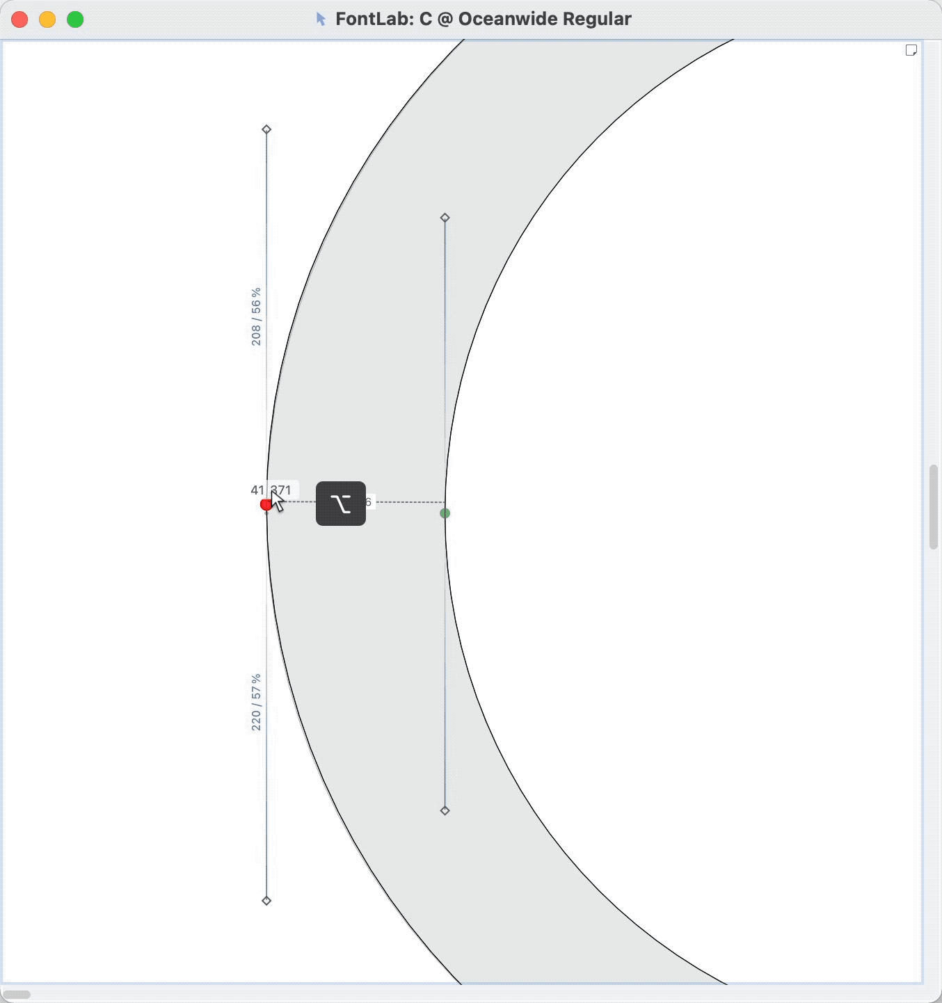
The Power of Alt
Most of the time we think about the nodes as being stationary—the grounded outline of our letter. That means handles are the ones that always have to do the work!!
Alt dares to be different.
He says, “Break the rules!! Who says that handles have to be the ones that move??
“It’s about time that nodes do their fair share.”
Alt get’s out his whip, and now nodes are the ones that have to move.
“Handles, here’s a well deserved break.” It’s Kit-Kat time for them.
With Alt handles stay the same. The nodes are the ones that move.
Alt-drag works like this. ▼
What is this good for??
It’s great for when you have to adjust a curve a little bit. (More about that in the curve sculpting tutorial.)
Keep you options open!
Tip #3: Power Nudge Is Your Friend
Power nudge allows you to move a bunch of nodes as a time. The handles and nodes adjust.
It allows you to do crazy stuff like this. ▼
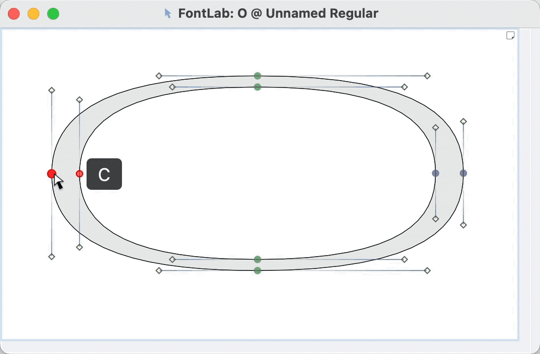
Hold down C. The stem of your mouse cursor turns black.
Or double-click the Contour tool. And activate it from the toolbox.
I rarely move curves without power nudge!
Tip #4: Command ⌘ Is Your Friend
This is called “lever”.
It works like a real lever. This tool transforms large motions of your mouse and hand, into little itty, bitty, pixely motions.
If you want this to be always on, select it from the Contour toolbox.
Command Is Precision
Makes sense, right?
PRO Tip
Use your mask! Before you make some of these changes, go to menu: Tools > Copy to Mask. Or push CmdM. This will copy your shape, or a selection, into the mask. That way you can compare before and after. Also, if you make a mistake, the original is right there.
PS
The Right Height
Getting the height right is actually quite trickier than it seems. See this tutorial for all the details.
Now that you know power nudge, that makes getting the height easier.
If you are doing an ornate script with many varying heights, you do not need to get the height perfect.
In fact, evening it out might be bad for your design.
But if you are making a sans, serif, blackletter, or a formal script, everything should not look like this.▼

Here’s a basic guide for you.▼

Some things to notice:
- O goes a bit over and under the lines. Notice what other letters go above and under the lines.
- In this font the d is the same height as the H, but usually the d is taller.
- The f has a gap above it.
- The g has a gap below it.
- The p descender is a bit higher up than the g.
- t stroke doesn’t go all the way up.
- The numbers don’t go all the way up. (But sometimes they match the height of the caps.)
Keep this in mind as you make your letters.
Warning
Don’t use transform to scale up or down your letters! This will change their stroke weights. Instead use the white contour tool and power nudge.
But really, go to this tutorial on heights before you go much farther with your drawing. Fixing letter heights after the fact is a big pain in the keister.