Briem’s notes on type design: The letter S
No part of the alphabet causes as much bad language as the letter s. Here’s a way of getting from beginning to end.

On the left is Arrighi’s letter. On the right is our goal. It’s well balanced, with smooth curves, and resembles the other capitals.
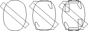
Start with the outer path of the letter O. Fetch the template for curve width and enlarge it by 4 to 5%. Give it the slant your want for the letter S. It will be the spine.
Next fetch the bottom right serif from the letter E. Flip one copy vertically and put it at the capital height. Put another copy on the baseline and flip it horizontally. Put them where you want the serifs of the letter S to be.
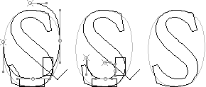
Then fetch the template for horizontal curves. Put one copy at the top and another at the bottom. And fetch the template for the straight vertical stems. Reduce it by 10 to 15%. (This affects how the curve swells from thin to thick. You may want to try a few widths.) Put one copy on either side where you want your curves.
Now you’ve got a foundation. Let’s work on the curves.
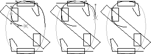
First reduce the left side of the curved path. On the left it should overlap the left side of the vertical template. And further down it should almost overlap the spine. You won’t need the bottom right part; cut it out.
Next reduce the right side of the curved path. Make it overlap the top corner of the serif.
Then remove the overlap of the curve and the serif. Join the ends. So much for the outer curve. And the inner is much the same.
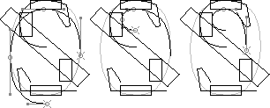
Begin by fetching another copy of the letter O path, or at least three-fourths of it. Align the top of it to the underside of the horizontal template.
Next reduce the left side of the path. It should overlap the right side of the vertical template and nearly overlap the spine.
Then resize the right side of the path. The curve should overlap the left side of the serif.

It’s time to tidy up the top half of the letter. First remove the overlap of the curve and the serif. Join the ends.
Next join the loose ends of the curves and the upper end of the spine.
Then remove the templates from the top of the letter. The curves probably need slight adjustment. You need to see what you’re doing.
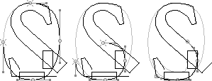
You make the bottom half of the letter much the same way as you made the top. First fetch the third copy of the outer path from the letter O. Again, you only need three-fourths of it.
Next you reduce it in size, aligning it to the vertical template and the spine.
Then you join it to the serif at one end and the spine on the other.
For the inner curve, begin by fetching the fourth copy from the letter O, just as before. Move it to the upper side of the horizontal template.
Next adjust the size. The left side should overlap the right side of the serif. The right side should nearly overlap the spine.
And then you get rid of the templates, remove the overlaps, join the loose ends, and adjust the curves. You’ve got a letter S.

We’re not quite done, however. Arrighi’s letter slants. So we’ll give ours a little push. The letter on the right slants by about four degrees.
Follow this approach, and you will have a respectable letter S at the end of it. There’s more, of course. There’s always more. But this is enough for the moment.
Notes on type design. Copyright © 1998, 2001, 2022 Gunnlaugur SE Briem. All rights reserved. Republished with permission in 2022 by Fontlab Ltd.