Intro: What is Hinting?
The opinions here are my own and do not necessary reflect the views of FontLab.
Make Great Fonts for Screen
Hinting is all about designing great fonts specifically for screen. It’s also about adapting your desktop fonts to look better on screen.
Hinting gives the rasterizer instructions. A rasterizer is software that instructs the computer how to make vectors into pixels.
There’s quite a bit to learn, if you don’t have hinting experience.
For me personally, this has been a challenging subject.
The only places that have all the information (Adobe Type 1 Spec) are clouded in jargon, from an era when fontmaking was specialist enterprise—certainly closer to engineering.
Still, these resources don’t tell you WHAT to do. That information is scattered throughout the web on forums and such.
My hope is that if you are new to hinting, this series will give you more information in one place.
If you are someone with moderate experience, hopefully this helps you fill in possible gaps.
If you are a veteran, maybe this will help you see some topics in a new way, find the settings more easily in FontLab, or find new ways to teach the subject—in addition to what you already know.
In this series you’ll get this:
- For veterans, exact locations of all pertinent settings in a 90 second read
- If you are new, know exactly if your font needs hints
- How to set up your fonts for hinting
- The two types of hinting
- The three levels of hinting
- Special settings to tweak your hinting
- Export settings that change how your fonts look on screen
- How to quickly modify hinting
- Finally, recommendations for fonts designed specifically for screen
You will find out what to do, but more importantly, what not to do.
Also, you will see some of the drawbacks to hinting.
Is Hinting Needed?
Apple
Apple devices don’t use hinting at most sizes.
I can understand their reasoning. Much font hinting is bad.
However, if a font is correctly hinted, Apple rendering is much blurrier in comparison.
Check this out.▼

Just about the same exact size in Apple, with their proprietary rendering, and inDesign, using the manual PS hinting inside the font.
Hinting Desktop Fonts
Desktop fonts are still outselling webfonts. When I’m talking about desktop fonts, I’m meaning fonts mostly designed for print.
One might say, “Many documents are probably going to be printed on high resolution devices that don’t need hinting.”
However, while the end-end users (the persons reading the printed pages) won’t see the impact of hinting, our end users will. The people designing the pages… on their screens.
That’s because the people buying fonts (at least retail ones) identify as graphic designers. In the United States alone, the Bureau of Labor Statistics says there are 254,100 graphic designers.
Some of these designers will use inDesign—which does use hinting, even on Mac.
Besides this, inDesignusergroup.com reported in 2011, 86 groups with total membership of over 51,000.
I don’t know how many people use inDesign, but it has to be in the hundred thousands.
If you want to delight your inDesign customers, your fonts need to be well hinted.
Now for Microsoft Office.
Although people using Microsoft Office (particularly Word) might be less likely (percentage-wise) to buy retail fonts, the number of people using this software is a whopping 1.2 billion people! (Source: https://www.windowscentral.com/there-are-now-12-billion-office-users-60-million-office-365-commercial-customers)
Hinting will make your desktop fonts look better for your customers. They are designing books, magazines, flyers, and posters where?
On screen.
In this series on hinting, I will do my best to explain to you—in plain English—how to get your desktop fonts looking better on your customer’s monitors.
Hinting Webfonts and UI Fonts
There are 1.4 billion people using PCs. Edge, Firefox, and Chrome for Windows use hinting.
This means that if you hint well, your webfonts will look better for billions of people!
When you design fonts for screen, you need to follow stricter rules.
To summarize:
Desktop fonts designed for print have less strict hinting rules. UI and web fonts have stricter rules.*
I will do my best in this series to say which rules are webfont rules and which are desktop rules.
* By webfonts I mean woff, woff2 used for web. By UI fonts, I mean desktop fonts that are embedded in PDF or other digital document, or are used for screen UI’s. UI fonts are OTF or TTF’s designed for screen.
Why Is Hint an Afterthought?
Take two fonts on a screen at text sizes. A bad font, well hinted will look better than a good font, badly hinted.
With these huge numbers of people using fonts with hinting, why is hinting sometimes an afterthought?
I love hinting!
Hinting is an easy way to make your fonts look better than most of your competition.
I love seeing the letters really sparkle.
This is what I mean.
Suppose you have a hairline font. You hint it really well.
You crack it open in inDesign (which uses hints), and your hairline is exactly one black (not gray!) pixel wide on a hi-res screen.
Goosebumps!
Now, I can’t put that picture up here. That’s because without the hinting, the picture renderer on your device might butcher it.
So, here it is blown up. You can see that hairlines are one, crisp, black pixel on a hi-res screen.▼
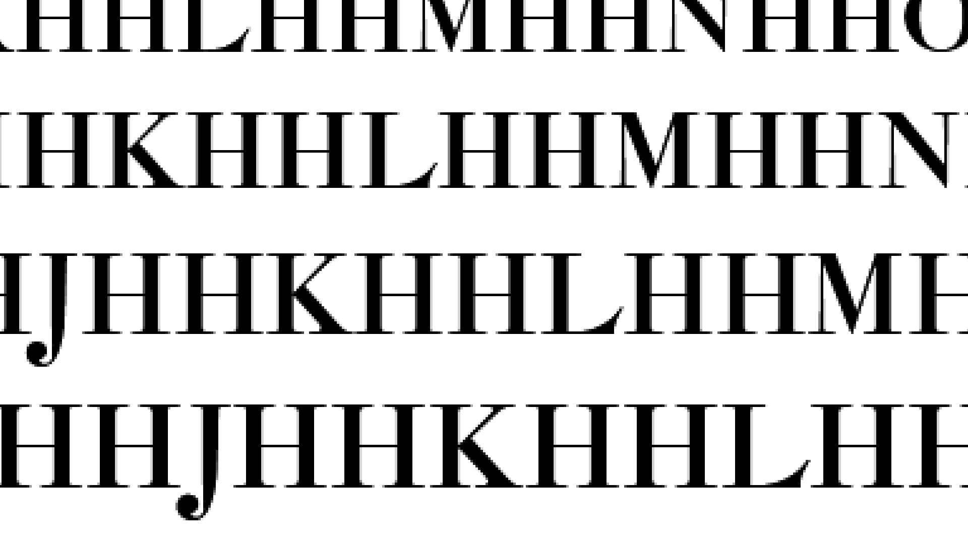
If you stand a bit far away from your computer, until the bottom line looks about 17 points in size (5 – 7 feet away on desktop???), you will see how sharp this is.
And this is just PS (OTF) hinting!
In this series on hinting, these are the types of results I want to give you.
Hinting aligns your letters to the pixel grid to make them crisp as possible.
Levels of Hinting
There are three levels of hinting: Family, Font, and Glyph.
You need to set each of these well to get crisp letters.
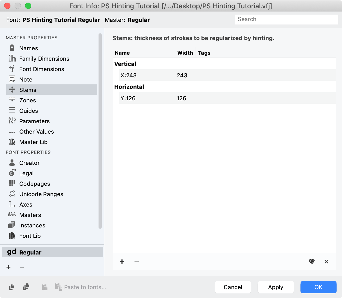
Font Level Hinting
Font hinting is arguably the most important. It is tricky and easily ignored, because it is abstract. You set a bunch of numbers in Font Info. Like this:
Glyph Level Hinting
If you are doing autohinting, you usually don’t deal with glyph level hints.
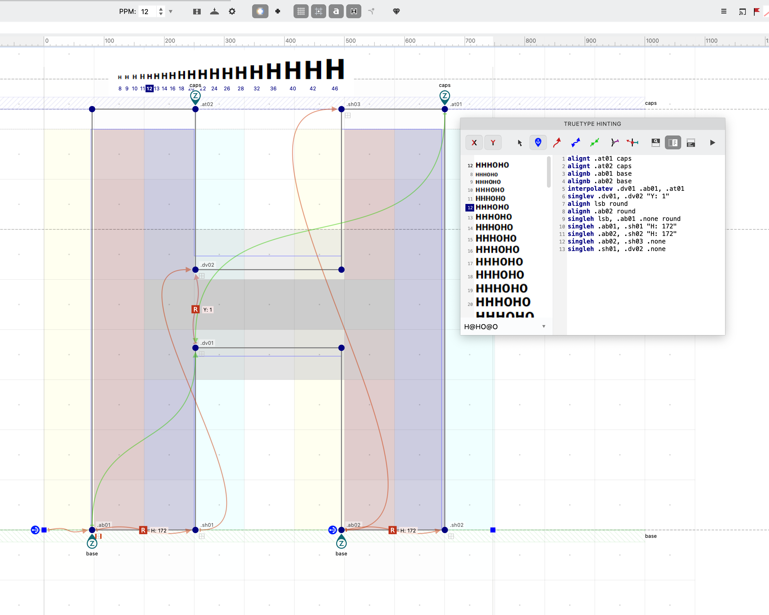
For PS hinting, glyph level hints are green lines that have thickness. (the ghostly green part)▼

Types of Hinting
PS Hinting
This is the “main” hinting used in PS flavored fonts (Desktop: OTF, Web: WOFF2, Variable PS (beta)).
PS hinting is fairly easy. However you have less control than TT hinting.
TT Hinting
This is the type of hinting used in TrueType fonts. (Desktop: TTF, Web: WOFF, VTT:Variable).
This type of hinting is complex, and uses a series of commands to instruct the rasterizer. (The software that assigns color values to pixels.)
An example of glyph TT hints is this:
Now, I don’t know how to do TT hinting very well. But if you are a TT hinter coming from another program, I will show you the main commands in FontLab.
Pros use manual hinting for their Variable TrueType fonts.
If you are beginner, I will give you some resources to learn this skill.
Also, we’ll look at how to get decent TT autohinting. This will help your WOFF webfonts and Variable TrueType fonts looks as crisp as possible.
Excited to show you what you can do!
But first…does your particular font need hinting?? Let’s find out in the next tutorial!