Briem’s notes on type design: o-group three: the letter s
In the sixteenth century there were two kinds of the letter s.
One was the short, curvy kind that we see everywhere nowadays. It was used to end words. And when two letters s stood side by side, it came second. (Arrighi did as he pleased.) The other shape was the long letter s, looking like the letter f without a crossbar.
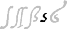
On the left of this line is a single long letter s, followed by a double long letter. The third is the common combination of the two letters together: one long and one short.
The fourth is Arrighi’s short letter s, wide and nearly topless. And on the right is a swash letter he sometimes used to begin words.
The short letter is too wide to blend into a column of text. I tried; here’s the test.
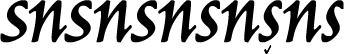
This line shows half a dozen letters s. The widest is on the left and the narrowest on the right. Which of them goes best with a typical italic letter, the n? I chose the second from the right. But please work on whatever width you like.
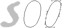
Here’s a way of making the letter s. Take the the outer path of the letter o. Reduce it by a fourth and slant it ten degrees.
You can use curves from the capital letter we already made. First align the path segments on the right to the oval. You can do it the same way as you did when you made a bold in the second exercise. Next align the path segments on the left. Then remove overlaps and join loose ends. And define the ends. I used straight lines at right angles. Finally you remove the path segmants you don’t need, join loose ends, and smooth the curves a little.
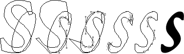
When this is done, you’ve got a letter s.
Notes on type design. Copyright © 1998, 2001, 2022 Gunnlaugur SE Briem. All rights reserved. Republished with permission in 2022 by Fontlab Ltd.