Master Strategy
Benefits Save time and energy and make an informed decision about your multiple master strategy.
Strategy 1 – Outer Master Method
Theoretically, this would be the best way to make a font.▼
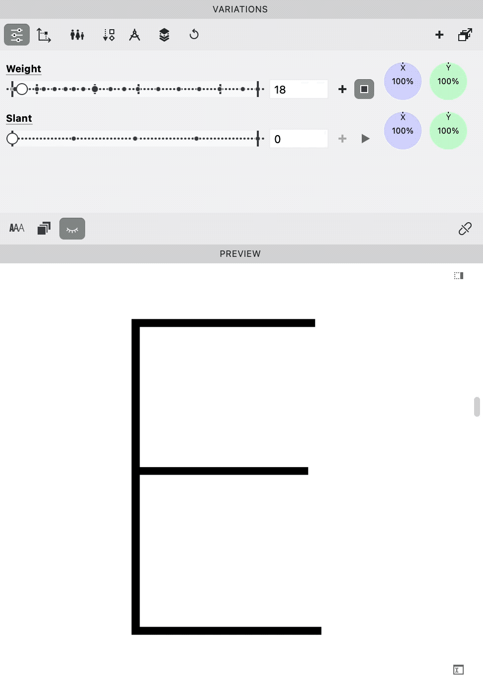
❶ Start from Skeleton (Hairline) Master. (Zoom in if you can’t see the E.)

❷ Add your darkest weight. (You might not want to add this dark, as you will see in a moment.)

❸ Interpolate.

❹ Correct main weights.
We’ll call this the “Outer Masters Method”.
The Problem
Well the problem is, suppose you want your bold to be the main weight.
However, if you used the “Outer Method” your bold interpolation (mix) would look like this.▼

Yikes!
“Triple stackers” look especially bad.
Basically…the computer is making the main weight!
Other Disadvantages
- The computer scales linearly. There should be acceleration and different interpolations of different elements. (Underware presented this topic at an ATypI.)
- Kerning might also have trouble with interpolation.
- Probably difficult to do without experience.
Advantages of the “Outer Masters Method”
- Widths are more consistent. Your variable font sliders will be better.
- Potentially, much time saved, especially if you have font experience.
- Might get interesting interpolations that you hadn’t considered.
- Practical when there is not that much difference between the weights.
Computers might be able to make good middles.
But at this point, with current technology, computer interpolation doesn’t work well.
Middle Master Method
Practically speaking, a lot of time you will start from the middle weight.
For example, when Adrian Frutiger made his Univers font, he drew the Regular. He completed the regular widths (Light, Bold, Black) with an assistant. The expanded and condensed were made by two more designers. (Under Frutiger’s supervision.)
Frutiger started from the middle, Univers “Roman 55”.
We’ll call this the “Middle Master Method.”
(Because your primary weight/width/contrast is usually somewhere in the middle.
The Middle Master process for weights might look something like this.▼
❶ Create your middle master.

❷ Define your Skeleton (the minimum).

❸ Define your Black (the maximum).

❹ Interpolate.

❺ Correct as needed.

For this particular letter here is a final solution. The masters are labeled in orange. The one in burnt orange is a glyph master (intermediate master).
Here is an example Bold.

Mind you, this is after a LOT of correcting.
Advantages
- Your middles might look closer to how you intend.
- This method might work better for monoline (low contrast) fonts.
Disadvantages
- This method is a lot of work.
- You might have worse outer masters.
- You might get unsmooth interpolation, like this.▼
Tip
Start with the important stuff first.
Tip
The Price of Perfection is (the loss of) Personality.
Info
In the above examples, I’m not advocating that you complete ALL symbols before moving on to the next master.
2D Outer Master Method
2D plane gets trickier.
If you design the outer masters of a plane, you’d design these.▼

This is what you’d have to design using the Outer Method for a weight and width axis.▼

Now the letters you are actually designing are quite weird.
How are you to know if the middle width, looks like the widths we have above?
Well, what does something smack dab in the middle of that?
So take a guess!
And place your best bets.
Here’s the middle—your new normal!▼

My guess was totally wrong. This looks more Tron-ish.
This is starting to turn into 3D chess!!
3d Masters
Now for 3D chess.
If you add another axis, you have a cube.
Here’s I’ve added a contrast axis.

The gray g in the middle is an even mix of all the masters.
This middle is just that…
… middling.
Plane and Cube Size
It would be a mistake to overgeneralize the above.
We were looking at large planes. Large cubes.
Many other lines, planes, and cubes are much smaller and the outside strategy is more feasible.
In the sections on weights, widths and optical sizes, you will see a better comparison to know the ranges of some common fonts.
Checking Your Middle
Suppose you went from inside out—Middle Master Method.
It’s a good idea to check what you drew against what the computer would draw.
Sometimes I’ve found that the computer did it better!
So with slight corrections I replace my work!
Here’s how you can add a different middle character in FontLab.
Change a Middle Master
Here’s how you change a glyph from a middle master.
⓿ Prep. First download this file:
Download ZIP
I am sharing the font with you under the SIL Open Font License which allows you to study it.
Info
Remember how in our example of widths the middle g looked very square? Check out the g in the file and see that there’s a similar thing happening.
Next open up the Variations Workspace.
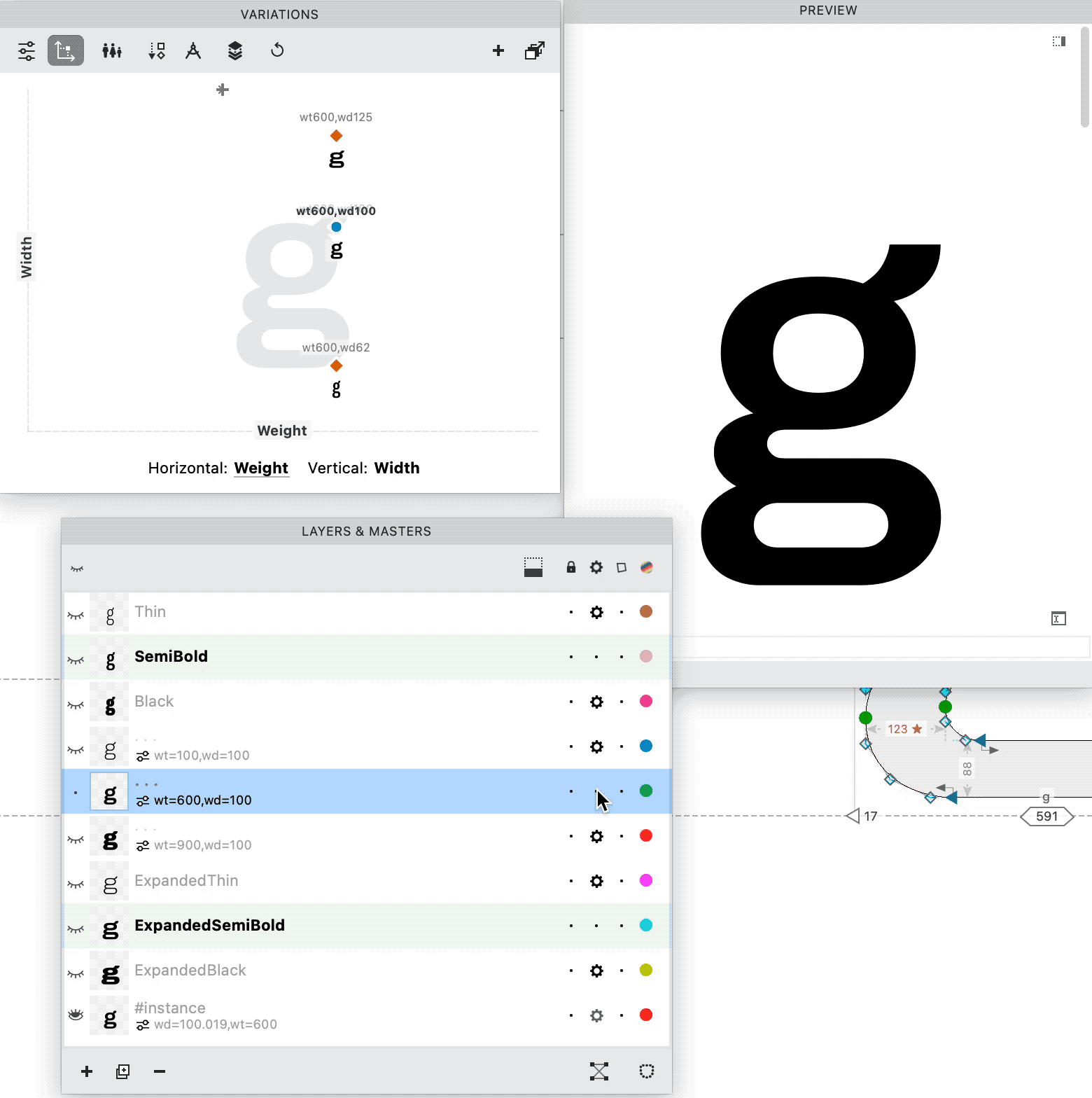
❶ Getting our bearings. Go into the g, because we’ve been picking on him.
The Layers & Masters panel should look like this.▼
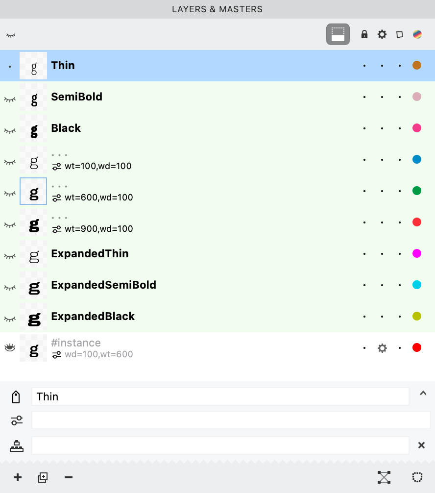
The ones without bold and without names are the glyph masters (intermediate masters).
It seems pretty clear that they worked on this font from the outer masters.
❷ Turn off the masters.
Suppose we just want to take a look at the semibold?
You turn off all the other masters by pushing the dot underneath the gear symbol.
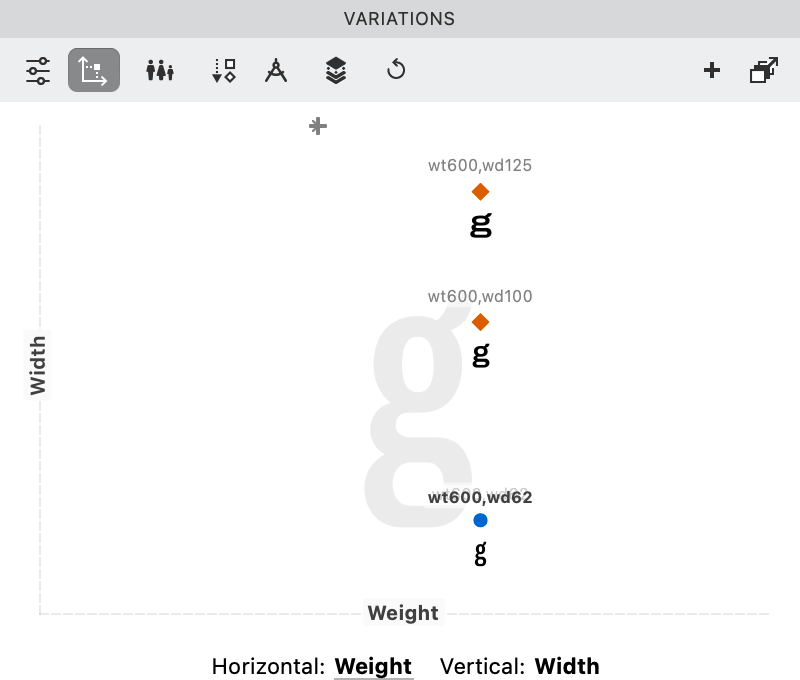
Now look at the Variations Panel Map. There are the three widths of semibold, all alone.
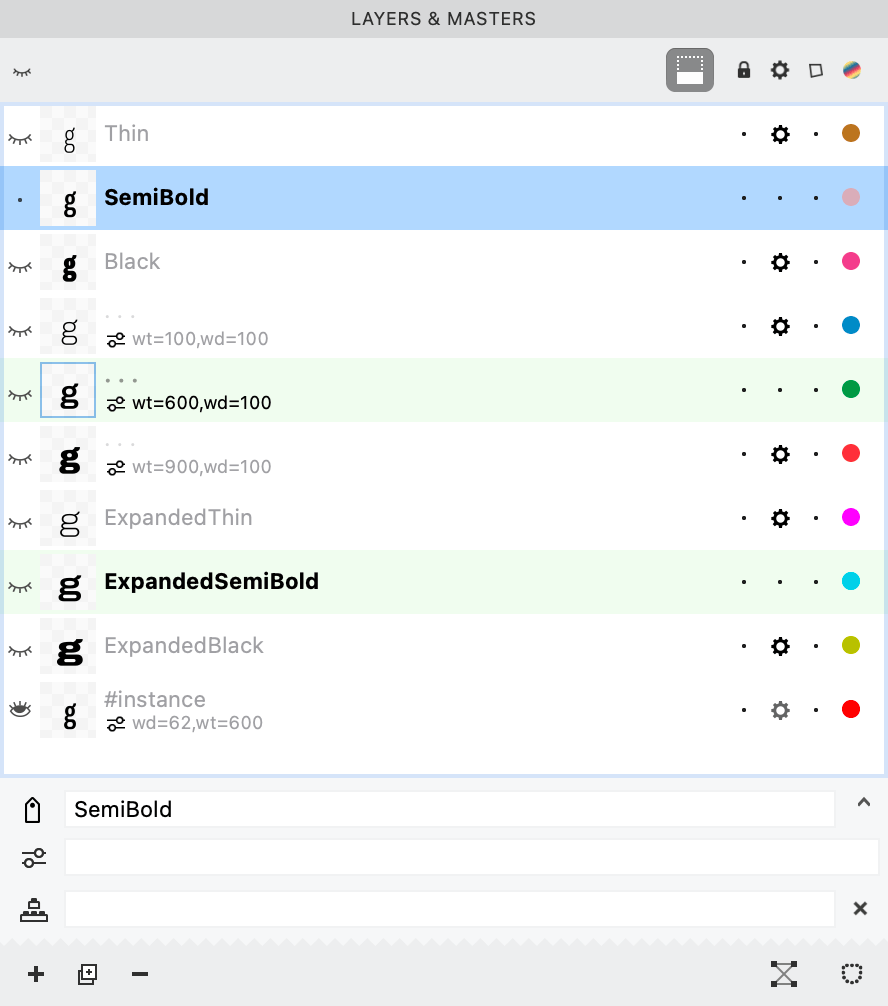
❸ Understanding the corrections made.
The middle master is the one that the font designer used to correct the g.
How do you check it out?
Move the blue dot on top of the middle g orange diamond.
Open up the Preview panel. Make sure that Preview instance is on.
Now you can turn his correction on and off, by clicking the gear of that layer.
Like so.▼
Info
If the g disappears, in the Variations panel, jiggle the blue dot.
Your middle is showing. ¦-|
That’s it!
This is a great way to compare your correction to the computer’s interpolation.
Info
The weights in here seems to be a pretty good selection. I’ve found with sans’s like these, if you have a master around 40 (40 unit n stem) for the normal width and a master around 124 (124 unit n stem) for the semibold, it interpolates the lights, mediums and regulars pretty well.
Obviously, everyone has their own way of marking semibolds and bolds. These seem to be pretty solid numbers for a monoline sans of ~530 lowercase height.
Conclusion?
There’s a paradox.
If you want to create more dimensions, you’d want to do less work. You want to make just the corners of the cube.
But that doesn’t always look the best!
Ironically, the more dimensions you have, the more your have to start from the middle—increasing the work further!
Recap
The main ways to start a family is: from the outer masters, or from the inside/most important master.
Its tricky to figure out what option is best!
You might want to try it with a couple letters first.
Maybe triple stackers (a, e, g, E, G) double stackers (O, o), single stackers (n, l, L, I), and diagonals (v, V).
It’s really enjoyable when you find a unique solution for your particular font!
Cheers,