PROJECT: Fixing the S Problem
Download VFJ
Look at this S made geometrically from two semicircles!▼

Check out that curvature comb!▼

Yikes, this transition is even worse than the n!
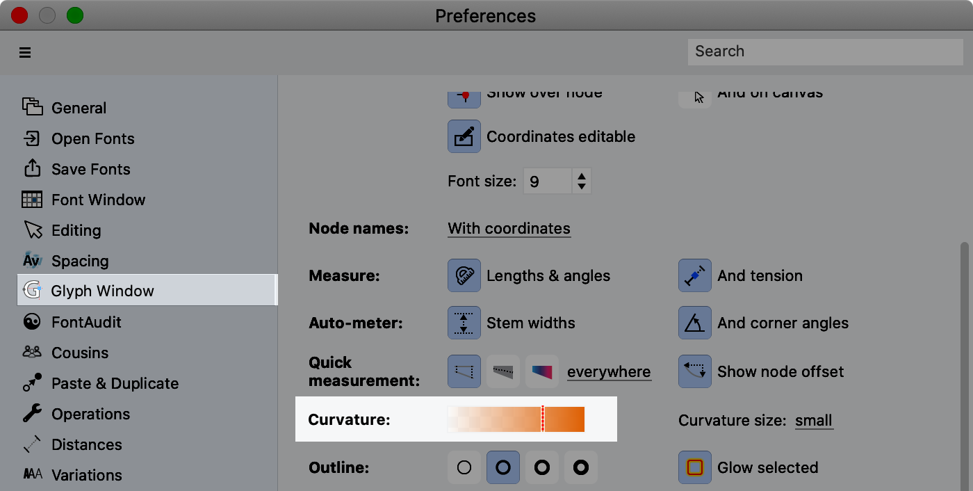
Before we work on the S, let’s turn up the curvature settings to largest.
Go to Preference > Glyph Window > Curvature and turn the Curvature size to large.▼
Fixing A Junk Transition
You are starting to see what makes a bad transition.
Huge jumps in the curvature comb.
So with the curvature comb on let’s just delete the node in the middle and see what happens.
You’ll end up with this:

Warning
Don’t turn on the curvature comb if you need to zoom in close or if your symbol has a lot of nodes. Calculating the curvature comb takes a lot of computer resources. Only have it on when you need it.
You see how the transition point is more smooth now?
You can see it is an inflection because the orange changes sides in the middle.
Fixing More
So you can always push Space to see what a shape looks like. Even though the line technically has no width, FontLab gives it a little so you can see it!
When you push Space, it should look similar to this.

This no stroke width shape is called a “skeleton”.
Some font designers draw these skeletons before drawing full letters.
However, skeletons are difficult if you are new to font design. We’ll turn on stroke to make problems more noticeable.
Step-by-Step
❶ Open the Stroke Panel. Go to menu: Window > Panels > Stroke ❷ Change the stroke to 60.
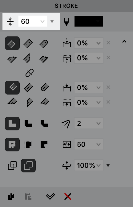
❸ Now push Space.

Look at this shape. Where does it feel lumpy?
It helps to look at the whites inside the shape.

❹ But really there are two problems when we look back at the curvature comb.
1) There is a bulge in curvature. 2) The transitions are bad *.▼

Info
These bad transitions, I will call “curvature crimps”. Kinks are to G1 continuity, as crimps are to G2 continuity.
❺ There are many ways to fix this, depending upon the result that you want. We are actually going to move the handles down, because this fixes both problems simultaneously.
On the right, move the top handle down.
On the left, move the bottom handle up!
It should look like this. At the transition, the orange curve should be more smooth.
Here’s what it will look like.▼

❻ Push Space to see how your shape looks.

So now we have gotten rid of the bulge in the CURVE.
But we have not gotten rid of the bulge in the CURVATURE.
In other words, the orange still bulges.
❼ Now, you might want to leave the orange bulges in. But I’ll show you how to get rid of it, if you want.
Here’s one way to remove the bulge (and there are others):
Move the top green node upward. Move the lower green node downwards. Use a regular select. Then move with the keyboard arrows.
Like so.▼

The orange should bulge about the same on each side of the green nodes.
I moved each about 24 or 25 up or down.
You can even get rid of the orange bulges more, but that will probably change the curve too much.

Now obviously, this is not a real S yet. It has no optical corrections. It feels like it is falling backwards.
In a later tutorial, we’ll look at more strategies for improving curve smoothness.
But still, this is a lot better. Look what we did in a few steps!
