Making a Large Display Letter
Benefits Test your letters at many sizes to avoid wasting time on deficient designs.
Here we’ll modify our H for different sizes.
Usually I’d do more of a complete alphabet first. However, changing one letter into many different styles or sizes can’t hurt that much.
It will give you an idea of flaws in your design, saving time if the idea doesn’t work.
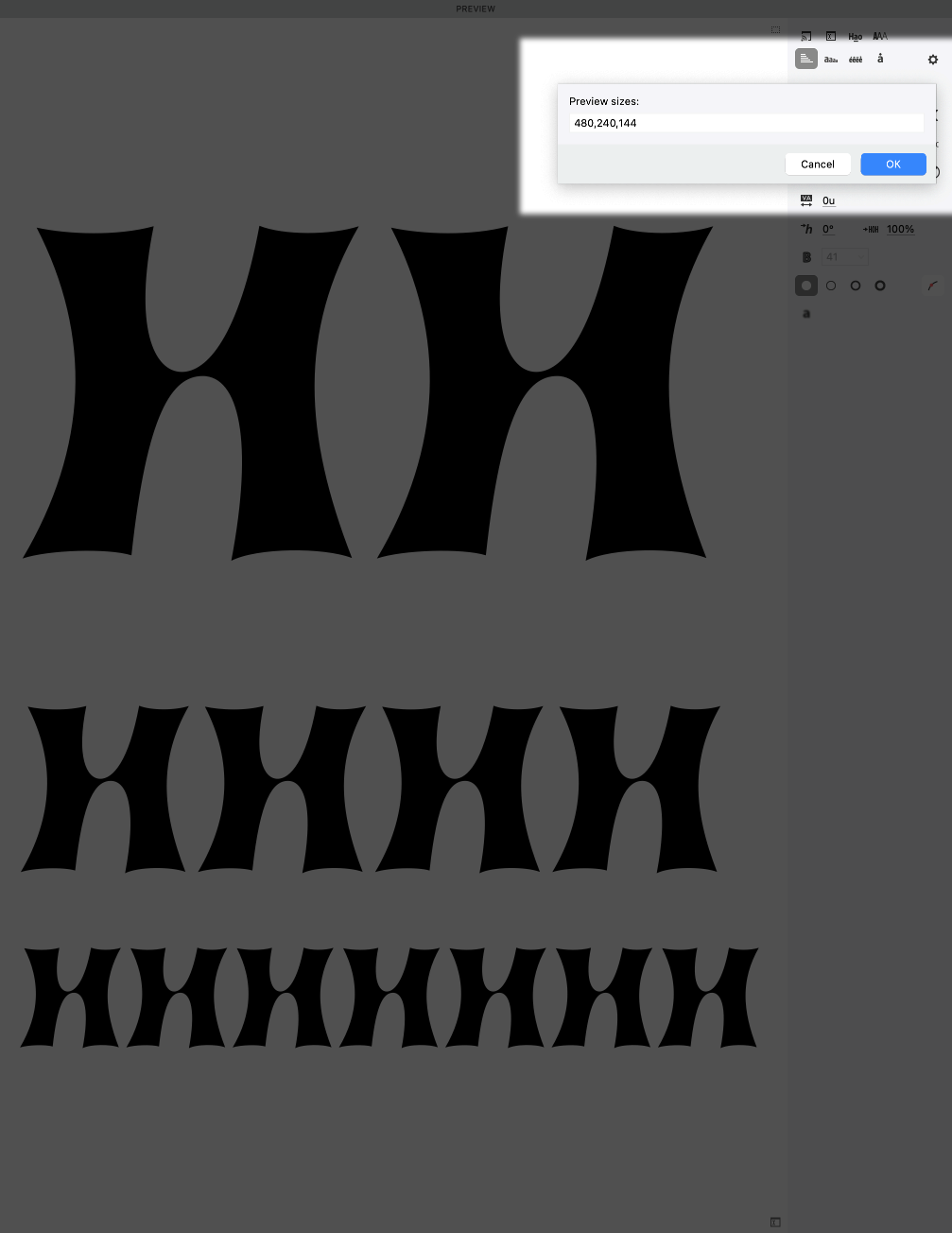
Waterfall
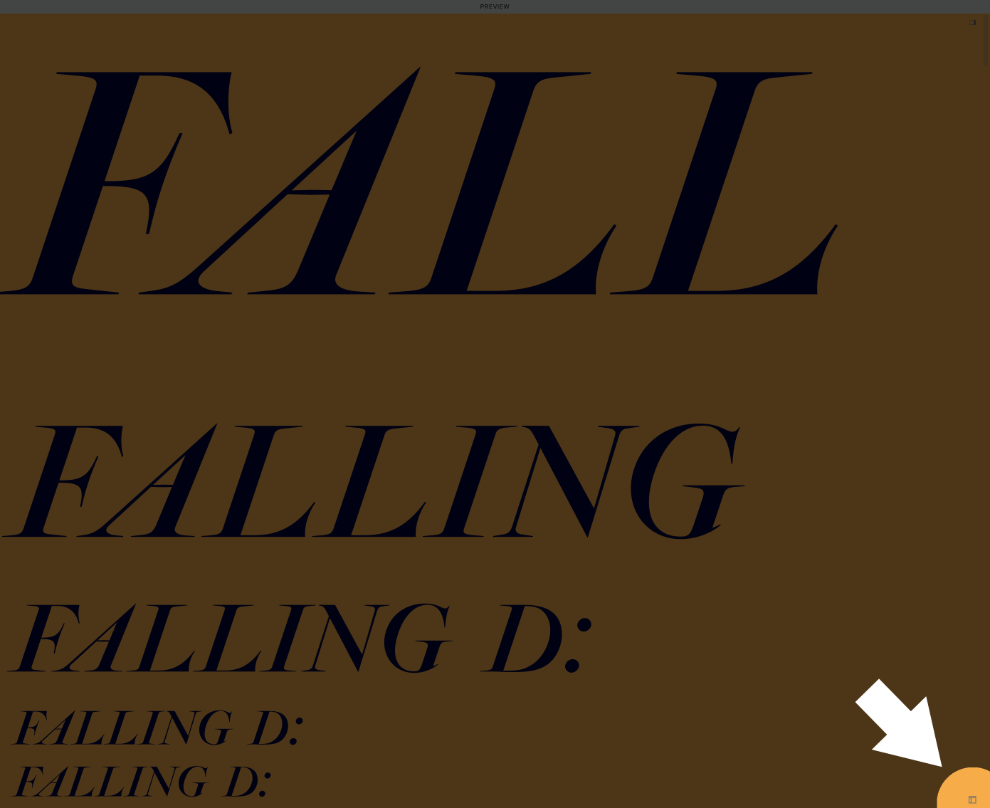
What’s a waterfall?
It’s consecutive rows of the same text, at smaller sizes.
Like this.▼

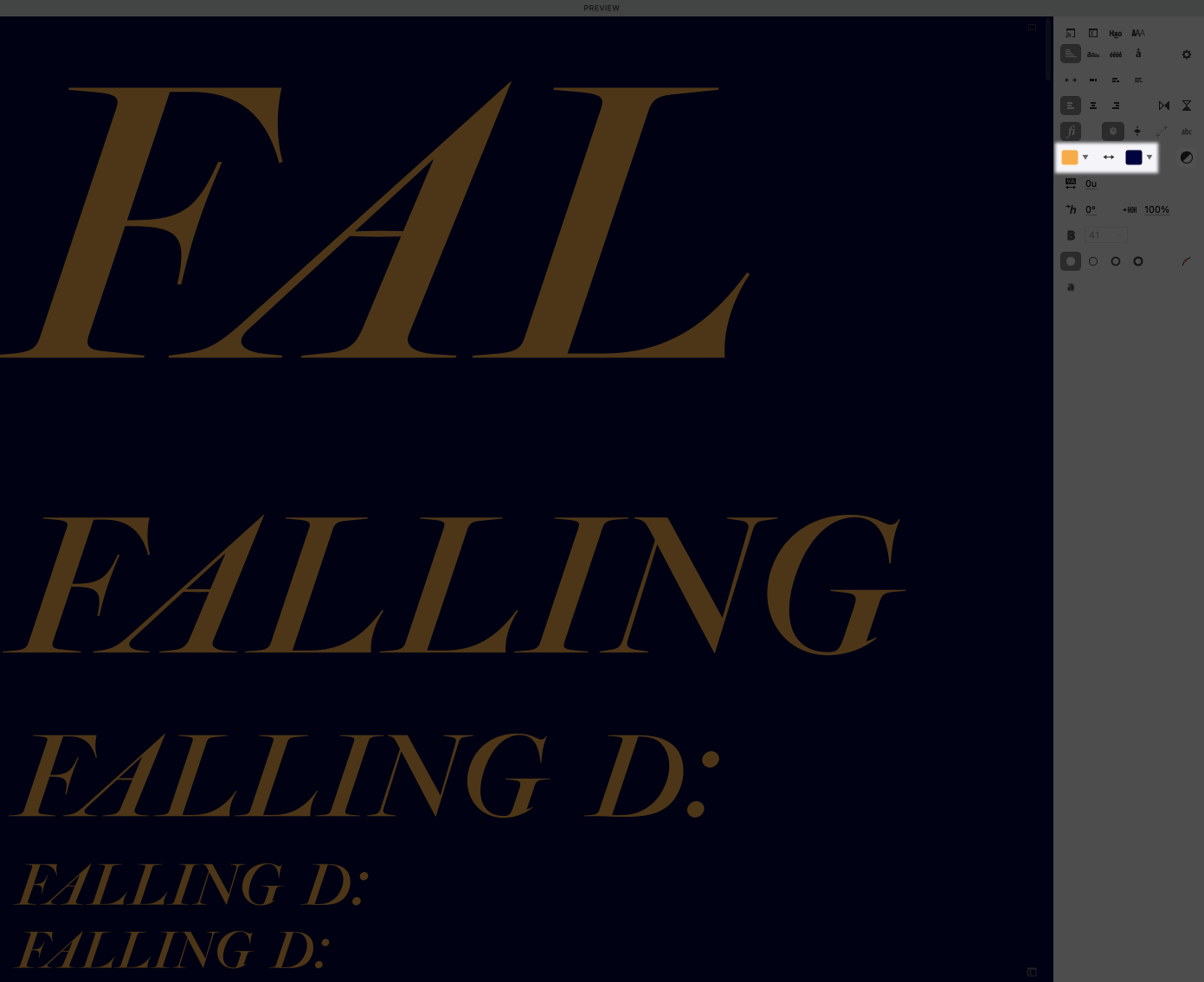
You get to the waterfall through the preview panel.
In FontLab 8, the waterfall now includes text mirroring. So you can just highlight the text in the font window and it will show up!▼
Use this button to turn on mirroring.▼
Check your design in reverse. Use this button to flip colors.▼
Checking your font’s sizes
Now let’s bring up the waterfall for our letter.
Yikes! Today this shape is creeping me out.
I don’t like anything except the top three rows. Anything lower than that and it makes me feel itchy. Like scratching styrofoam or honeycombs.
What sizes work for you?
My assessment
First I’m not liking the way that the serifs poke down.
Second, the asymmetric middle counters are confusing at small sizes.
Third, the serif shapes are being lost at that size.
At the upper sizes, this shape looks pretty good. Because we worked on it at a big size!
In my opinion this is a font that needs a separate text face.
It doesn’t necessarily need a sharper display face.
But, it would look cool, so I will try it below.* This is how feature creep sets in. That’s when you keep adding more to a product…sometimes the project becomes impossible to finish. It’s a form of Xeno’s paradox.
For what it’s worth: feature creep with a client is almost always a bad thing, because they will keep expecting more and more. Feature creep in retail is not necessarily a bad thing. You need your product to stand apart from others, and what better way to do that than allow your font to grow naturally. But you also need to know when to just stop.
The details could be sharpened to help it sparkle more.
Let me show you how to make this letter super sparkly.
How to Make a Display Font
Option 1: Maximum Sparkle
Here we take the font to the dry cleaners. It is cleaned. Starched. Pressed.
I’m going to work on this in a separate optical master. For information on setting up masters, see this tutorial.
Here’s the workspace I’m going to use: Open your Elements, Variations, and Layers & Masters Panel.
First thing we are going to do is work on the middle to get that looking thinner.
Warning
If you like your current waterfall, leave it the same. Or save it by copying it into a notes document.
click the gear in the Preview panel.
My usual setup for displays is: 480, 240, 144, 72, 64, 48, 32, 24, 18, 9. I’m going to delete everything except the top three sizes. Now my preview looks like this.
Besides making the middle thinner, I’m going to increase the curve tension of the inside to make the stems look a bit more solid.

Now let’s get the serifs—well the points—sharper (to get higher spatial frequency) by dragging the handles inward and upward. This is what I mean.

Oh yeah! And don’t forget to put a mask before you start!!
You might end up with this.▼

But now this is too spiky. Just looking it up, and fear of needles is trypanophobia. We don’t want anyone to freak out about our letter.
What we do is duplicate the tip nodes (CmdD). Then drag the nodes a bit until we have a tip that is 4ish units tall.
Here.

That now feels more letterly.
This is for huge, huge, huge impractical sizes. Even at 144 points, the middle starts to fade away.
Option 2: Sparkle with Legibility
Let’s add a bit of legibility.
Add a mask before making any changes.
Ok, now power nudge the middle apart. You might get something like this.

Now here’s a trick. Go to menu: Tools > Swap with Mask. Remember the shortcut. Now use that to flip between the mask and master.
You should be looking at your Preview panel while you flip.
The first H seems better, so let’s put that in the master.
Two things not so good right now.
- The stems are a little too uneven.
- Counters inside are not as interesting as before.
- Crossbar too high.
So here’s some modifications.

Couple things I like about this.
The H feels more H’y.
Also, crossbar looks like it is tilting up, like calligraphy—albeit lazy calligraphy.
Also, the H has a feel of the old phototype machines or Xerox machines. This H imitates the blurring.
Caution
The middle of the H contains “rubbing curves”. They work for a one master font. However if you make a font family with rubbing curves, be prepared for a lot of headaches. Weight and width axes are especially bad, because you have to control no less than (4 handles+1 node) × 2. To get the correct interpolation, you have to control 10 unruly points! And that’s across many masters!
Here’s an example of taking out some of the blurriness or “sfumato”. This simultaneously increases the spatial frequency.

Or if, like a dentist, you don’t want a double concavity, delete the nodes of the inside stem. Then option+drag the segment to pull out the handles.
You would get something like this.

But I actually like it more if you make the inside convex.

But we’re going back to the weirder blurry one. (Which you can do using your history panel BTW. But I like all of these so I’m saving them in separate files.)
To be complete, a couple more things you can do.
Display Final Touches
Reduce stem weight and narrow entire letter.
You can achieve most of the tasks by selecting one side and moving it inwards. This simultaneously reduces overall width and stem width.

Repeat on other side.
PRO Tip
Reduce the stem weight of a hairline. Otherwise it will look much too bold.
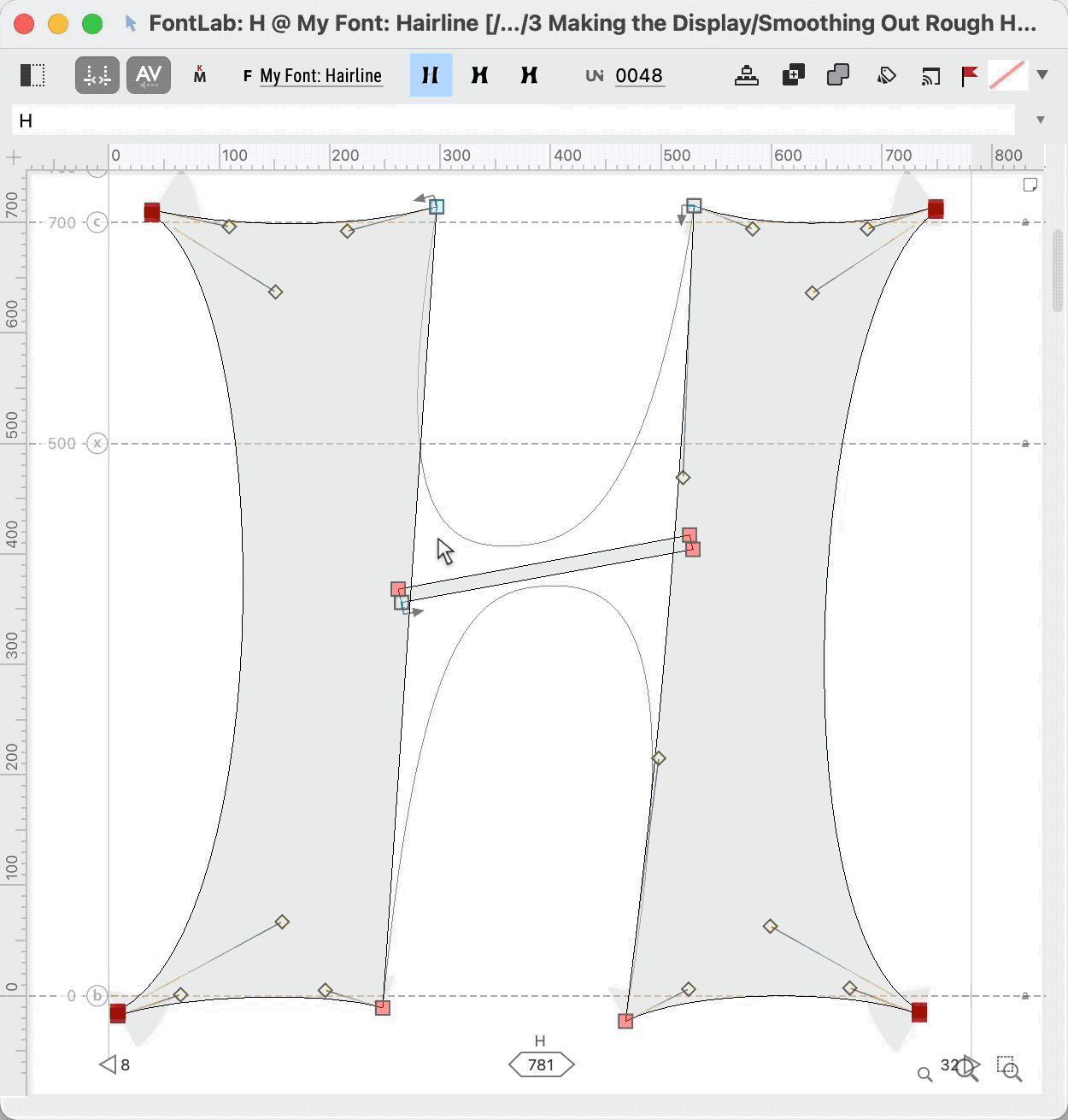
Final Node Structure
Remember that this is not a final node structure. At minimum we would need to have a node on our cupping serif, if we want to hint. (hints are instructions that tell the computer how to turn the shape into pixels.)
That’s about it!
Hairlines and large displays don’t take as much work. But they do take a keen eye and attention to detail.
Wait till you see how much we have to change the letter to make a text sized version!
Great work!