Briem’s notes on type design: Numerals and oddments
We can make most of the numerals from the same modules that we used for the capitals and the lower case.
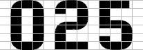
The shape of the numeral zero is the same as the shape we gave the letter O. The numerals 2 and 5 are easily assembled from curves and straight lines. The numeral 2 looks better if you shift the middle down a bit. And moving the middle the numeral 5 slightly upwards will also help.
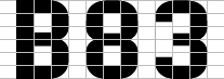
The letter B provides what we need for the numerals 8 and 3. The outer shape can be flipped horizontally and joined at the top and the bottom. The numeral 3 can be cut away to match the numeral 2 and the letter c.
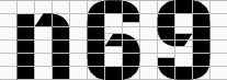
With the numeral zero as a starting point, the numerals 6 and 9 hold few surprises. Fetch the diagonal from the letter n.
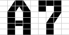
The diagonal from the letter A makes a respectable middle for the numeral 7.
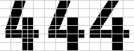
With the diagonal at the standard slant, the numeral 4 looks awkward, just like the letters z and k. Even if you can give the oblique any slant you like, the proportions give you a narrow choice. The counterspace of the narrow numeral on the left is too small. A generous counterspace, as in the numeral on the right makes the shape too wide. I prefer the middle way.
Notes on type design. Copyright © 1998, 2001, 2022 Gunnlaugur SE Briem. All rights reserved. Republished with permission in 2022 by Fontlab Ltd.