PROJECT: Smoothing Out Pencil H
Benefit Confidence in turning any shape into a sparkling letter.
Download VFJ
Before we go further into looking at the curvature comb and the classes of continuity, let’s do some more work on our pencil H from the first drawing.
If you don’t have yours, you can use mine.
In this tutorial you’ll see how to hone a rough shape in FontLab.
It’s like what sculptors do right?
They start with some rough block, then they go over it over and over until it shines.
Here’s what we are starting with:

Yikes!
This will be impossible to fix using automatic methods. That why we are refining by hand.
Pin Down Your Structures
Starting Out
Open up the file.
First thing to notice—no nodes are extrema.
Extrema will be a dark green. These are all bright green.
First thing we will do is turn off the curvature comb, because he’s not ready for smoothing yet.
Second, stick a copy of him in the mask. Push CmdA, then copy to mask (CmdM).
We put him in the mask to make sure we don’t change him too much. And it’s good to have a backup copy.
Nodes at Extremes
Go to menu: Contour > Nodes at Extremes.
You should have.▼

The problem with this is that we didn’t get all our extremes!
Info
FontLab has a tolerance of about 1°, where it will not add nodes at extremes.
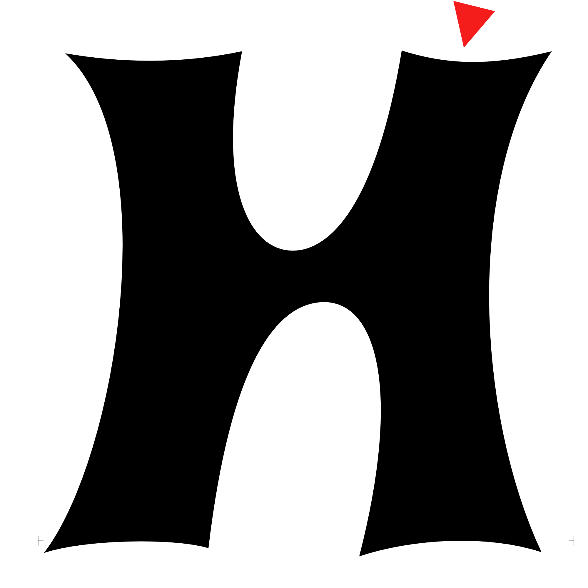
Here’s how you can make extremes where the red triangles are.
Remember how we used Shift-double-click handle (yellow node) to straighten extremes?
In this case, that would deform our shape even more.
So instead…
Hold Alt. Double-click the yellow handle.
The green node will slide into place!!
Remember: Shift means constrain and Alt means slide.
Shift-double-click to move handles straight. Alt-double-click to slide it straight.
Cupping to Correct Level
Our letter has “cupping”.
That when the bottom instead of straight, looks like this.▼

The extreme node of the cup must rest on the baseline. The top extreme node must be at the Caps Height. (The line labeled with the circled c, ©.)
Otherwise your hinting will be messed up.
Couple ways you can do this.
Here, you’ll see how to do it with power nudge.
Before you start, go to the Contour tool box and choose the power nudge subtool.
Do the same for all your cups.
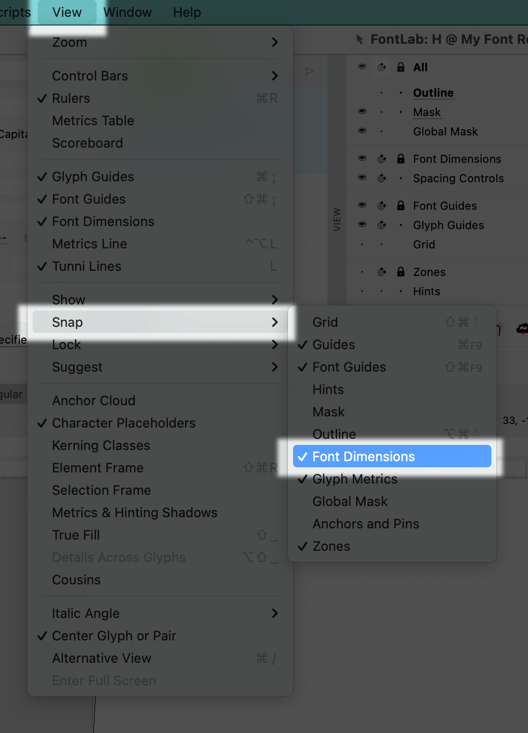
Make sure that snapping to font dimensions is on.▼
Finishing the structure
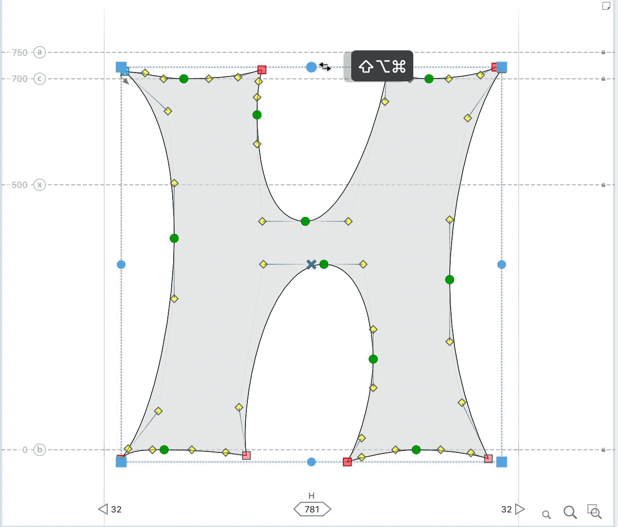
❶ Fix any extrema that are missing. ❷ Manually delete any extra nodes. At this point, you should be about here:

❸ I’m going to delete the circled node. That way the inside shape is more similar to the top. Also it’s a shallow curve. (Usually not good.) ❹ There’s a lot of variation in the stem thickness. The left stem feels a lot thicker than the right. So use power nudge to pull that out until they feel equal. To do that, highlight this part.

PRO Tip
Keep your Preview Panel up. You can see what your change this looks like.
PRO Tip
Adjust your sidebearings after expanding a letter.
Modifying the Structure
Once you’ve gotten your letter in some shape like this, it’s a natural point to change the structure.
Since this is your first letter for this alphabet, you have a lot of creative freedom.
Almost TOO MUCH creative freedom.
If you had other letters already made, you’d need to make this match.
PRO Tip
Here we started from a basic letter. It’s not necessary to start from the basic letters (HOno). Often times, it can be better to start from complex letters. The R or G, or lowercase g or lowercase a.
Because the g is an offspring of the n and o, he will contain more alphabet DNA, than the n or o alone.
Then you can go back and re-create the g’s parents.
Tip
Don’t look at other work in this stage. I have a bad habit of this. That would cross contaminate your work.
Ways to Modify This Structure
Here’s some ideas for modifying this particular structure.
This is not a list to try with other letters.
You can try this with other letters.
But it’s better to vary the structure based on your particular alphabet and your particular vision.
Ideas for this letter:
Symmetrical
- Make the letter symmetrical. I take my favorite quadrant of the H. Then I paste the open contours like so.

- Now put it together, and do some refining.

I don’t particularly like this. The inside counters (white) look a bit…ahem…a certain way, if you know what I mean.
In font design, it’s important that you avoid anything looking scatalogical or suggestive.
Emphasize Direction
You could try emphasizing the natural direction of the shape. One way to do this:
- Highlight opposing corners and then use a free transform slant, holding CmdShiftAlt. Here’s what I mean.▼
After some refining, this looks windswept.

- Hint: Remove side nodes!
(Accidentally left a lump in the bottom of the top counter. The top of the bottom counter has curve tension problems.)
Simplify for Spacing
- Delete side and top handles.

I like how grumpy he looks.
I made the sides straight but left that at 2°. I like this solution. It still has character, but fits with other letters better.▼

Make Inside Straight
- If we make the outside straight, let’s make the inside straight. But I didn’t like that. So it turned out like this instead.▼

If you look at this in a waterfall, in middle and small sizes, it looks a bit like an X. That’s the danger with this design.
Vary a Previous Version
This is a variation of the previous version.

(In a final version, you’d want to correct the stem bowing near the crossbar.)
The stems are exact mirrors of each other. Since the stems themselves are not symmetrical that poses a problem… What type of stem should the “I” have?

These create a nice white shape.
Also it would fit pretty nicely with the O. Whatever that would look like. Maybe something olive like?

IDK!
So anyway, those are some different ideas for modifying a structure like this.
However, for the rest of this project, we’ll go back to the original.
Refining the Curves
We’re going to go back to our original H, hone that and see what happens.
⓿ Let’s put a fresh mask before we get started. Push CmdK to clear the mask. Then CmdA, then CmdM. To put the new mask. ❶ Sorry. I’m going to change my mind. Let’s get rid of constraining nodes. I know we just put them in. But they’re hampering our ability to make smooth curves.▼ (Constraining nodes are non-structural nodes. Usually, they hold curves in place.)

So highlight and delete.
Delete the two middle green nodes also. You should now only have sharp nodes. No green ones!
PRO Tip
The more nodes, the more control. The less nodes, the less restraint.
Modifying the Tops and Bottom Structural Nodes
If this was another style of font, you’d want to align the lowest nodes. You’d want to align the top nodes.
However, since this is a quirky display*, you can leave as is.
Evening things out would take away character.
*Even nodes are needed for hinting. See the hinting section.
❷ Start from the inner whites. Almost always it is a good idea to start from the whites (counters) of your letter.
But should it be inner white or outer?
If the outside whites are not as good, that’s not great, but can be OK.
However, when the inner whites are wrong it is immediately noticeable, or the letter will feel wrong.
Rule: When refining, don’t start with the black stroke, don’t start with the outer whites. Start with the inner whites.
We’ll inverse the inner counters to you can more easily see the shape.

See how they don’t match?
So now, our tasks are two.
- Shape one of the counters until it flows.
- Match the other counter to that.
To match, the second counter doesn’t have to be exactly the same. It just needs to feel compatible.
In this case, it would be good to make it about a 180° rotation, but a different size.
Here’s what I have so far.▼

Remember to push Space to see a simple preview.
With less nodes, you will get to a point where you can’t form the curve exactly how you want it.
Once that happens, add extreme nodes back in. Don’t add them in too early. It has to be at that right point, where you almost have what you want, but not quite.
If you are used to working with nodes at extremes, this might seems like a scary way.
Doing it this way, your curves are going to start much smoother.
❸ Ok, here’s the problem that the opening of the top is a lot larger than the bottom. So let’s open that up.
After adding extreme nodes, I adjust the curve tension upwards. Here’s the shape of my contours. See how much better the contours look?

Info
See how you can almost feel the H in the white, even though the outside is not there?
Why is that?
This is where your knowledge about smoothness levels and curve tension becomes handy.
Here we are throwing around our curves freely, without constraining nodes. By that fact, the curves are going to be G3. The super smooth curvature!
But usually fonts have G2 curvature.
Now for tension. If nodes are going straight up and down, G3 has less curve tension than G2.
Besides the shape, that’s why these counters are starting to feel letter like. (Having two shapes next to each other also helps, but I don’t think that is the main reason for this effect.)
Ok…
Here’s the shape so far.▼

❹ Outer whites. After you do the inner whites, it’s time for the outer whites.
Usually start with the bigger shape. However, we’ll start with the cupping, because I hate how those look.
Rule: If it bothers you a lot, work on it first. If you don’t it will be in the back of your mind, like a mosquito. Making you worse on whatever you ARE working on, and you may overcompensate on other details until this is fixed.
Cup length is uneven. Measure and adjust.
The main culprit is the top right arm. He’s too small.
Now you have to determine whether to take space away from the outside or inside.
Take space from the inside, because that was too wide anyways.
Now, this will make the bottom counter look off balance. So we move the top of that a bit to the right.
Here’s the H.
I don’t like what the top right cup is doing. Let’s see what is going on.
Turn on the curvature comb to get a better idea of the curves.

The curvature lacks focus.
The highest curvature is just randomly somewhere in the middle.
After adjusting, I find that I like the curvature lower on the inside, basically reversed from where it is now.
Once you get the cups how you like, adjust the sides.
The sides have an opposite problem. They feel like they don’t have enough curvature in the middle.
So adjust their handles.
Once you get a shape that you like, but is not all the way there, put down a new mask:
Replacing mask
To replace the mask first clear by pushing CmdK. Then, either leave everything unselected, or leave everything selected and push CmdM.
❺ Shape. Now let’s work on the shape of the actual letter, not just the whites. You can notice that the right side feels too thin again!
Notice the counter’s being pushed too far right, thinning the stroke.
Live Preview
We’re going to use the preview panel and “live preview”.
This makes the preview panel imitate you while you are modifying things.
You can see what your shape looks like in real time.
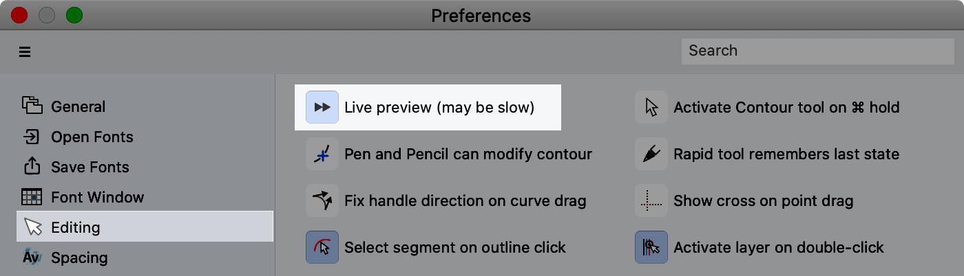
Go to Preview > Editing > Live Preview.
The Goal of Changing Black: Make the black more even while leaving the counter shapes still looking good.
How do you do this?
By selecting the correct nodes to move.
It’s a good idea to also look at the shape in reverse. Also look at the shape upside down.
Use this and similar buttons on the Preview Panel.▼
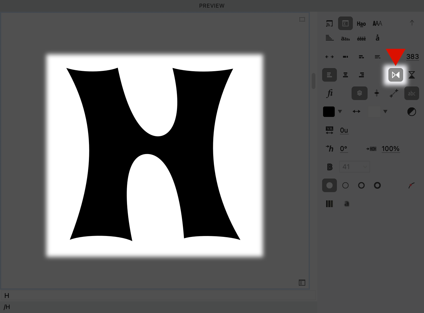
You can look at those shapes as you modify the letter.
Use flipped preview to tackle difficult shapes like S’s.
That’s it on this H… for now!
He came a long way, while still keeping much of his weird flavor.