Briem’s notes on type design: Spacing joined letters
Fitting joined letters together is different from the spacing we have looked at so far.
The spacing is a part of the letters themselves. The distance between them is decided by the reach of exit strokes and entry strokes. Awkward letter combinations can rarely be solved by kerning. You should take the joins into account right from the start. It is worth the trouble.
There are two main types of joins.

Join-to-join

Join-to-stem
In the join-to-join, the exit stroke of one letter meets the entry stroke of the next. This approach was used in metal typesetting. It was the only way. It is still used in revivals of historical typefaces and designs that are closely based on pen forms.
In the join-to-stem, the exit stroke of one letter either meets or overlaps the stem of the letter that follows. (There are exceptions; we’ll come to them.) The overlap makes even spacing easier to achieve.

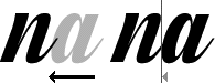
The example on the left shows the trouble with join-to-join spacing. The gap between two letters n is bigger than between the letters n and a. The entry stroke of the letter n takes more room than the entry stroke of the letter a. The black stems above the letters make the gap easy to spot.
The example on the right shows join-to-stem spacing of the same letters. The exit stroke of the letter n of the left meets the stem of the letter n that follows. The exit stroke of the middle letter n overlaps the bowl of the letter a. There are no entry strokes. The black stems above the letters show even spacing.
There are exceptions to this, as I mentioned.

The letters x and z sometimes need an entry stroke. These two have high starting points. Your exit stroke, unless it’s very high, won’t reach them. The letter s may need one as well.
Simple beginning
You start with a horizontal line when you space joined letters, either join-to-join or join-to-stem.

The line marks the beginning and the end of all joining lines. It also shows you where an exit line will meet a stem. I put this line halfway between the baseline and the midline. Yours can be higher or lower.
When your join fits all the letters, you can slide them from side to side until they fit.

Join-to-join spacing is simple. When your exit strokes and entry strokes meet, you’re done.
Join-to-stem spacing gives you some leeway. You can allow an overlap between an exit stroke of one letter and the left side of the next. This is useful if you want to tighten a gap. But if you need a wider gap than the exit stroke allows, you’re out of luck. You have to redesign the thing.
Notes on type design. Copyright © 1998, 2001, 2022 Gunnlaugur SE Briem. All rights reserved. Republished with permission in 2022 by Fontlab Ltd.