Briem’s notes on type design: Easy capitals
First, the height
Most of the capitals are made of lettershapes that we have already defined.
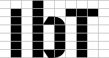
The letter b between the letters I and T shows the difference in the height of capitals and ascenders. The caps are one horizontal lower than the ascenders, and one horizontal above the x-height.
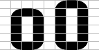
We have already created the letter o. A little stretching will turn it into a capital.
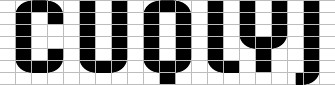
Making the rounded letters O C U Q Y calls for little more than careful copying and pasting.
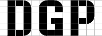
Adding corners to make the letters DGP is simplicity itself. You cut out a curve, and join the loose ends. In the letter G, the middle horizontal occupies half a vertical rectangle.
In these four, the middle horizontal doesn’t fit the grid. We will put it midway between top and bottom.
Here you may well point out that tradition calls for a bottom half that is slightly bigger than the top half. And you’d be right. The effect I have in mind breaks the rule.
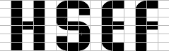
The letters E and F have rounded corners for no good reason. Consider it style; a feature if you like.
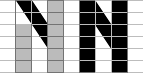
To make the letter N, use the same diagonal as before.
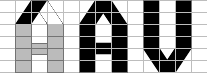
In the letters A and V, two diagonals meet in the middle. The horizontal bar echos the letters H S E F.
Notes on type design. Copyright © 1998, 2001, 2022 Gunnlaugur SE Briem. All rights reserved. Republished with permission in 2022 by Fontlab Ltd.