Briem’s notes on type design: The letter a
Making a bold letter a is not much trouble. But it does call for attention to detail.
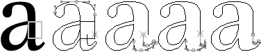
- Put a bold stem template on the regular weight of the letter a.
- Cut the path and stretch the top curve sideways to fit.
- Stretch the serif to the right, as far as you think a bold serif should go. Here it has been widened by about a third.
- Squeeze the inside curve of the serif until the loose end joins the stem again.
- Adjust the curve by reducing it vertically. This takes care of the right side.

The counter of the letter u is about the right size for the letter a. Begin by aligning the right side of the two. Next adjust the size of the counter of the letter a, both horzontally and vertically. Finally give the bowl the same thickenss as the left stem of the letter u.

- Squeeze the top counter sideways.
- Widen the bottom of the curve.
- Squeeze the top to match the curve.
- Cut the bottom of the curve and pull it down.
We’ve now got a bold letter a.
Notes on type design. Copyright © 1998, 2001, 2022 Gunnlaugur SE Briem. All rights reserved. Republished with permission in 2022 by Fontlab Ltd.