Briem’s notes on type design: Character width

Next to each other, these four letters look awkward. The letter o is too narrow, the letter n rather wide, and the letter e far too wide. They can be put right.
Let’s tackle the letter o first. Here’s a test.
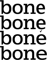
In these four lines, only the letter o is different. How wide should it be? The letter o in the top line is too narrow. It’s too wide in the bottom line. The second from the top looks all right to me.
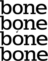
Here only the letter n is different. In the top line it is too narrow, and it’s too wide in the bottom line. (This is easy, believe me. You make a few blends and line them up.) The third from the top will do.
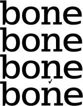
The top letter e is too narrow and the bottom letter e too wide. The second from the top looks fine.
Before: We started out with bad letter widths.

After: Now these four look all right together.
Four letters are a small sample, I know. But when you’ve got the letter b, the letters p d q are taken care of. With the letter n come the letters h m u. The alphabet is made of recurring shapes.
Run a few tests. You’ll like them.
Notes on type design. Copyright © 1998, 2001, 2022 Gunnlaugur SE Briem. All rights reserved. Republished with permission in 2022 by Fontlab Ltd.