Briem’s notes on type design: Spacing
The distance from one character to the next shouldn’t always be the same.

The width of the gap between these two letters is the the same as the width of the white space inside each letter. Half of it goes on each side of the letter, the sidebearings.
In this design, this is good enough for about 75% of the sidebearings. This is what the result looks like.
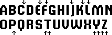
The arrows point at gaps that are too wide. The letter T is the most striking example. We’ll remove both sidebearings of the letter T altogether, the left of the letter J and the right of the letters L and P. And we’ll narrow by half both the sidebearings of the letters Y and Z, and the right sidebearing of the letters C E F. The letter K is awkward. We’ll take about a fifth off the right sidebearing.
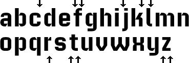
In the lower case, the letters f and t lose half the usual sidebearing on the right, and have none on the left. The letter j will have none on the left either, and the letter l none on the right. The letter z will lose half of both sidebearings, and the letter c half of the right. The right sidebearing of the letter k loses about a fifth, and the right of the letter r three-fourths. This is what the spacing looks like after the changes.
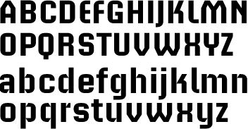
No doubt the results can be improved. But roughness is a part of this design. This is as far as we will go here.
The numerals should all have the same width. Otherwise, tabular settings meander. For the same purpose, I we’ll give half the width of the numerals to the wordspace, comma and the period.
If this is not enough, the chapter on spacing has more.
Notes on type design. Copyright © 1998, 2001, 2022 Gunnlaugur SE Briem. All rights reserved. Republished with permission in 2022 by Fontlab Ltd.