Briem’s notes on type design: Working from scanned art
Some people think working from historical sources is particularly easy. The work has already done by somebody else, they say; all you do is lay down Bézier curves. They should try it themselves.
Our starting point is a sixteenth-century handwriting manual, La Operina. It was written out by Ludouico Vicentino degli Arrighi, and printed from woodcuts by Ugo da Carpi. And it was the starting point for the BriemOperina typeface family.
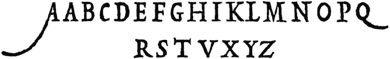
The upright Renaissance capitals resemble Roman inscriptions. The book also has many decorative variants that we won’t go into.
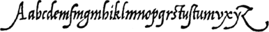
The lower case is an example of late humanist cursive.
This line has the letter m in abundance. It was used to demonstate the right texture for the lower-case letters.
Arrighi’s writing is a good starting point, but it needs work.
The first step in understanding it is to write it with a broad-nib pen. My two favorite books about italic are Scribes and Sources by A.S. Osley and The First Writing Book by John Howard Benson. Both are out of print, but easily borrowed on an inter-library loan.
I grouped the letters the way I like to work. You may well prefer a different arrangement.
Notes on type design. Copyright © 1998, 2001, 2022 Gunnlaugur SE Briem. All rights reserved. Republished with permission in 2022 by Fontlab Ltd.