Briem’s notes on type design: Framework
Making a grid now will save you trouble later
Early on, start thinking about a framework. Here are a few questions. How long will your descenders be? What x-height do you want? What is the best ascender height, the cap height, and the accent height?
Decide early how thin your hairlines will be. You’ll avoid tedious work adjusting them later. Begin with a foundation.
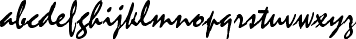
Mistral, Roger Excoffon’s remarkable script typeface, hasn’t even got a baseline. The design may look like a lucky accident. It isn’t, but the discipline is well hidden.
Even Mistral has a framework
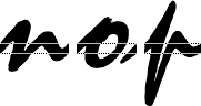
Slightly separated lower-case characters show how the joins depend on exit strokes and entry lines that are all at the same height. Most work very well.
Mistral was issued in 1953 as a hot-metal typeface. The letter o includes an exit stroke that looks like a comma, and can look awkward at the end of a word. This has remained unchanged in many digitized versions.

Curve bulge
A curve needs to go beyond straight lines. Otherwise, it will look too small. The Baskerville letter e is 14.3% higher than the x,. It goes both above and below the baseline. If you like numbers, Peter Karow’s book, Schriftstatistik , (URW Verlag, Hamburg 1992), is full of them.
Sample grid
Your framework will probably change as you go along. Here’s a start. The double lines are for straight lines and curves that extend beyond them.
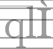
Useful horizontals (from the top):
- Accent line
- Ascender line
- Cap height
- x-height
- Baseline
- Descender line.
Will a framework interfere with creation?
That depends on how you like to work. Sooner or later, you will probably have to make measurements. Even an anarchic character set probably has some common features.
Notes on type design. Copyright © 1998, 2001, 2022 Gunnlaugur SE Briem. All rights reserved. Republished with permission in 2022 by Fontlab Ltd.