Briem’s notes on type design: The a-group
The lower-case stems should be lighter than the stems of the capitals: there’s less white space between them.
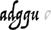
Four of these letters have a triangular bowl that is one of the characteristics of humanist cursive. And the letter u is much like the letter a with a missing top.
We should begin by digitizing the bowl of the letter a.
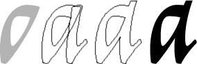
On the left is the bowl as I defined it. Next to it are outlines of the bowl and the stem of the letter i. And next to that is an outline of the letter a. The stem is higher and more curved. To the right is the letter in its final form.
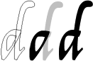
You can make the letter d from the bowl and the letter l. I extended the horizontal top of the bowl to the right. This makes the letter more interesting to my eyes.

The letter g can look better with a smaller bowl. Here it is reduced about 5%.

On the left of these four is Arrighi’s letter g.
Next to it is an outline of the bowl, slightly reduced, and a long stem. The descender doesn’t extend as far to the left as the original, but is still wide enough to cause an occasional overlap.
The third example shows the bowl on a stem and descender in gray. The thinnest parts of the curve are where a broad-nib pen would make them. I extended the horizontal top of the bowl to the right, as I did in the letter d.
The fourth shows the letter as I left it.
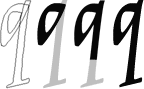
The letter q is made from the bowl and a straight stem. On the end is a pair of serifs, borrowed from the letter k. We can leave the letter unfinished until we get to that part.
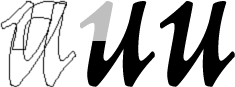
We’ll make the letter u from the letter a and an entry stroke (a serif, if you prefer) from the letter n. And we’ll attend to that on the next page.
Notes on type design. Copyright © 1998, 2001, 2022 Gunnlaugur SE Briem. All rights reserved. Republished with permission in 2022 by Fontlab Ltd.