FontLab 8 New Dark Theme
Relax Your Eyes
Benefits Relax your eyes. Work more joyfully and effectively with customized view settings.
Dark Theme is here!!!
The goal of this tutorial is to get dark mode on and show you the most important buttons to customize your look.
Try it out to see what you like!
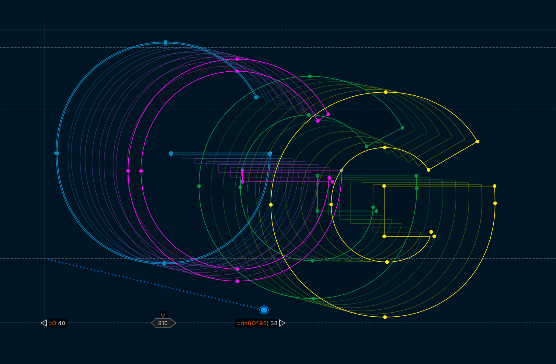
By the end you will discover how to make your drawing window look just about any way you want, up to this, if you love neon as much as I do:

Yessssss!
This is how font design should look in the 20’s and beyond!
(Though obviously you don’t have to make it look this crazy bright if you don’t want to.)
Activating Dark Mode
Go to menu: FontLab 8 > Preferences > General side tab. (PC menu: Edit > Preferences > General side tab.)
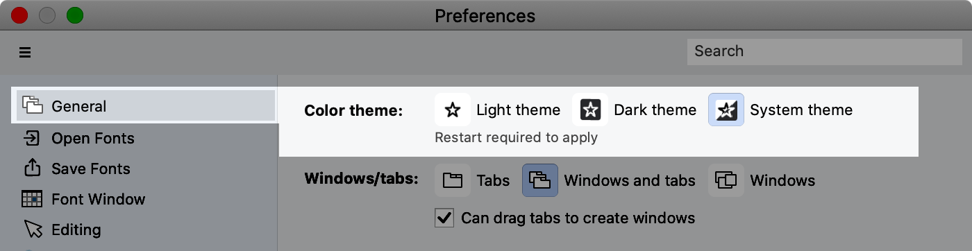
As it says, restart is required.
Restart FontLab, and welcome to Dark Mode!
Warning
As we make these changes for Dark Mode, we are also changing how light mode behaves. So if you love your settings for light mode, save your preferences first.
Tweaking System Settings
If your system mode is light, you will see that the top menu is light.▼
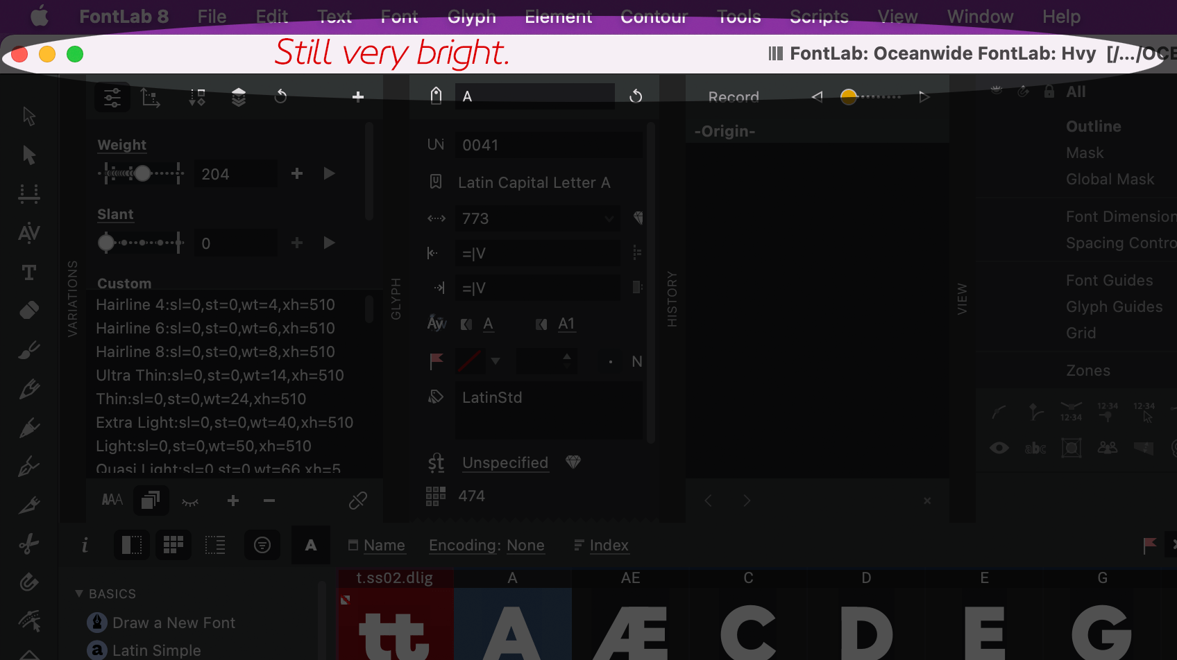
To fix this, turn on your operating system’s Dark theme.
Font Window
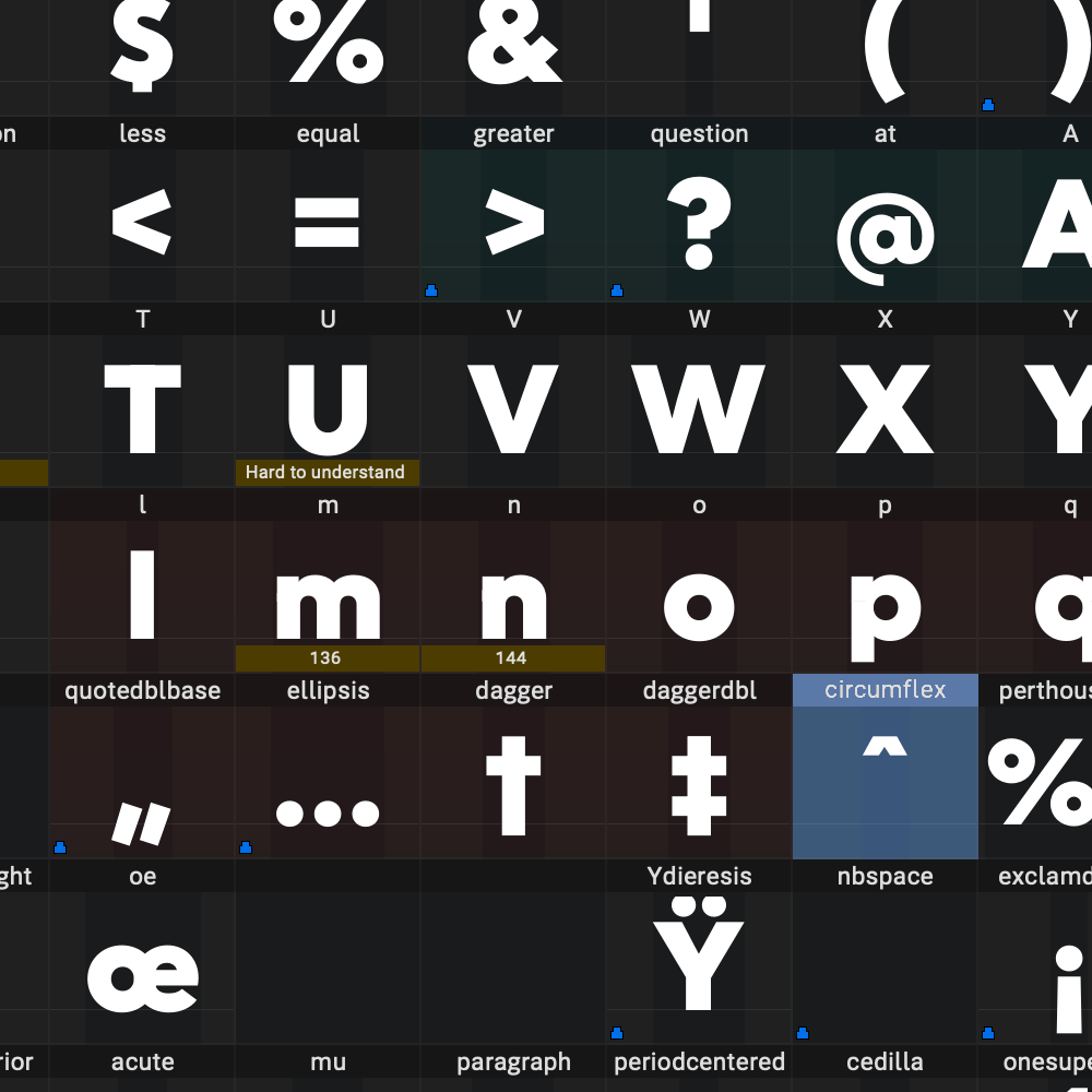
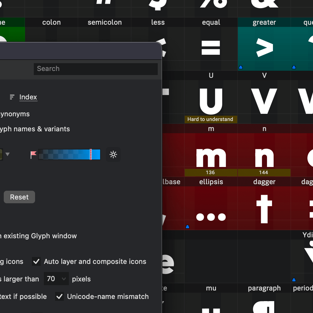
The font window is where you see all your symbols. You can customize this in dark theme.
Here is the Font Window in default dark theme ▼
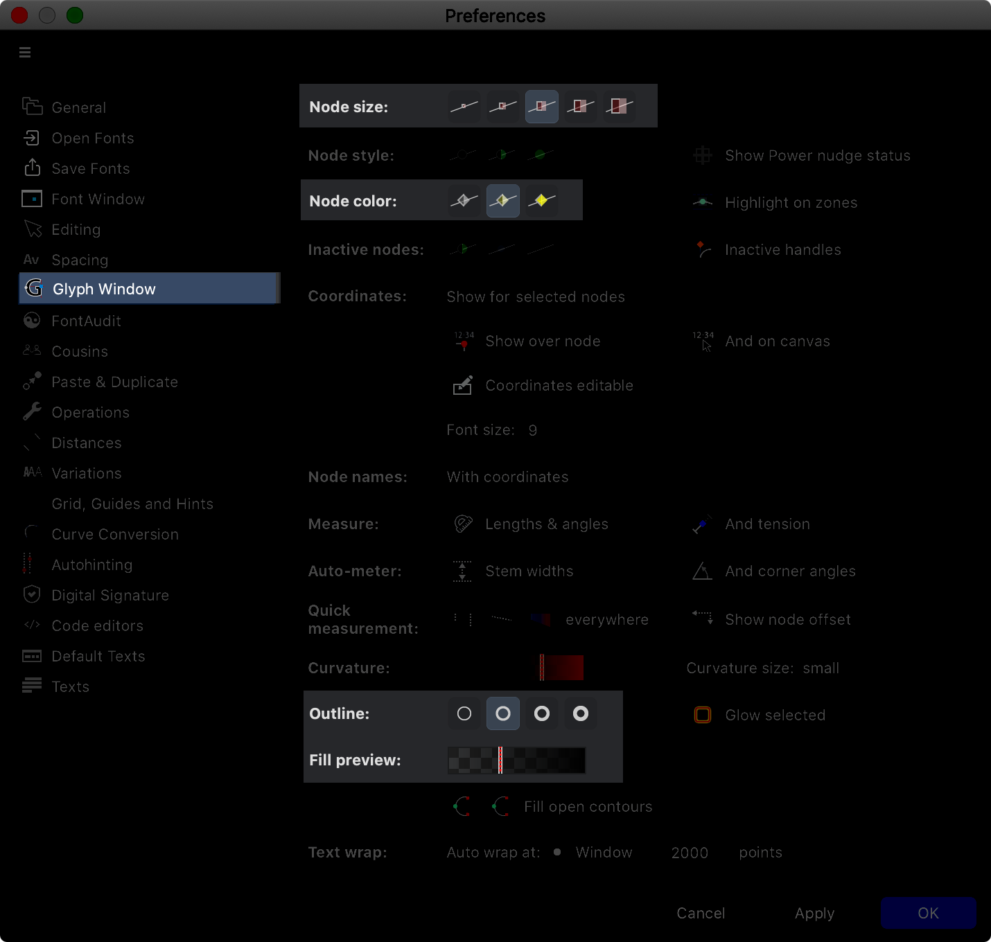
How to make your cell colors brighter.
Go to FontLab 8 > Preferences > Font Window side tab.
This section allows you to turn dark theme on and off, for just the font window, but also to change the cell brightness.
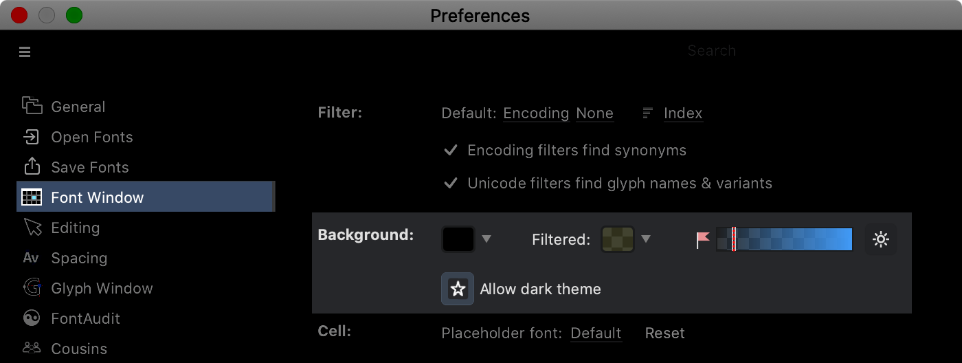
The button on the left that looks like a sun ☀ is the brightener, try that, and you can see the colors more clearly. (Note that the brightener also takes off the gradient, giving a flatter look.)
Now adjust the brightness slider to where you like it.
Here’s what I came up with, by just moving the slider ▼
Try your own FontLab experiments to see what you like!
Glyph (Drawing) Window
When you are driving at night, the tail lights and headlights sometimes look bigger than they are.
This is the halo effect or halation.
When you draw or view white letters on a black background, you need to keep this effect in mind. (Stuff looks a bit bigger than it actually is.)
That’s why the drawing window is defaulted to a white background.
But it is very fun to draw on black, or make adjustments in black.
Turning on Dark Drawing
Go back into Preferences, push the “Glyph Window” side tab.
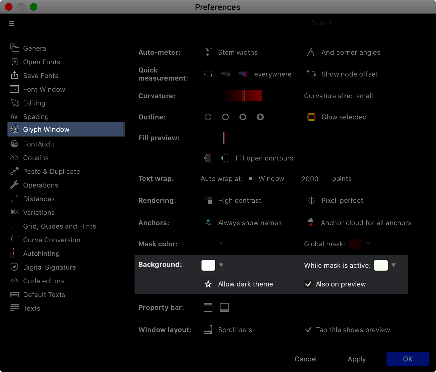
Hit the button “Allow dark theme” (☆), and hit apply…
Now…
What does the “Also on preview” button mean?
This adjusts how the Space acts in the drawing window.
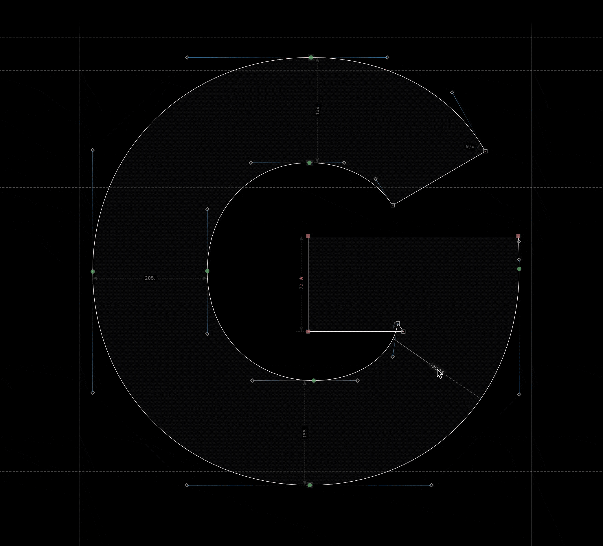
Pushing the Space with Also on preview on ▼
Advantage: This is great if you use the spacebar to move across the screen!
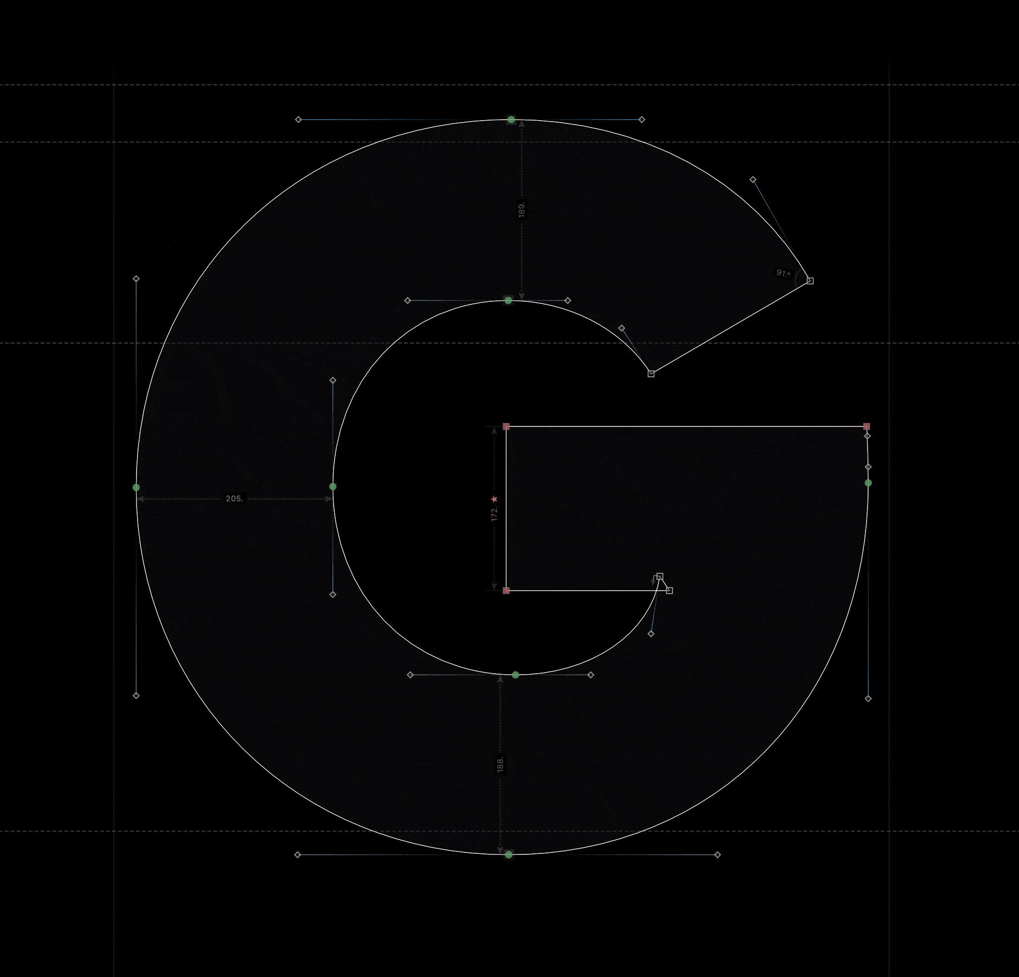
Pushing the Space with Also on preview off ▼
Advantage: Good if you want to see how your letter looks in light mode!
Those are the basics! Great work!
If you want to modify the dark mode more, here’s some more things to look at.
Finishing Touches on Your Dark Mode Look
If you want to make some more finishing touches, here are some areas for you to try.
First: Preferences > Glyph Window. Try changing these areas.
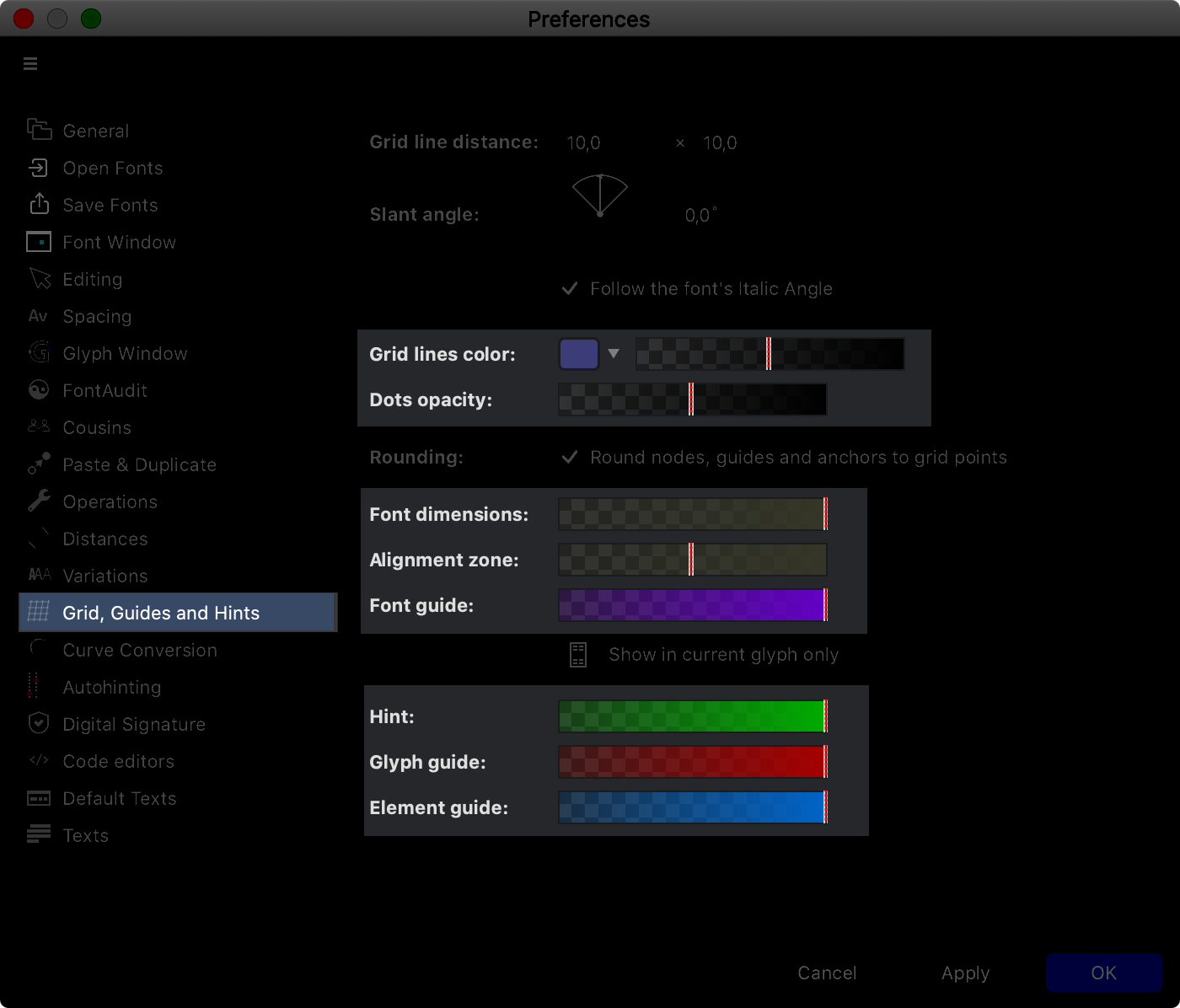
Also in Preferences, adjust these sliders to modify the color of your hints, guides, and grid.
Variable Design Sweetness
Now the best for last.
I was floored when I discovered this!
Go into Preferences again. This time to the Variations sidebar.
Turn on ☑ “Preview master color”. Adjust the slider.
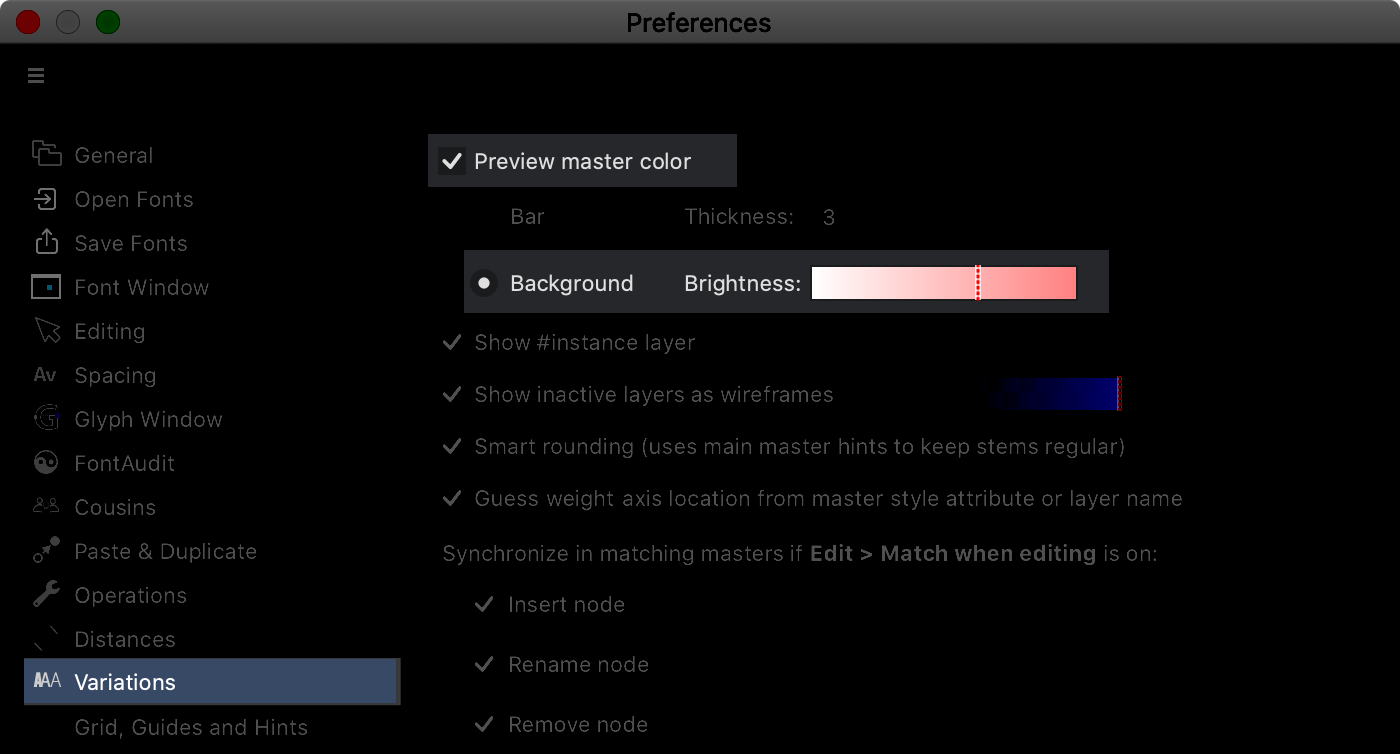
The background color will change!
These are the types of colors you can get: (And the colors on this GIF aren’t even as good as the real thing!)
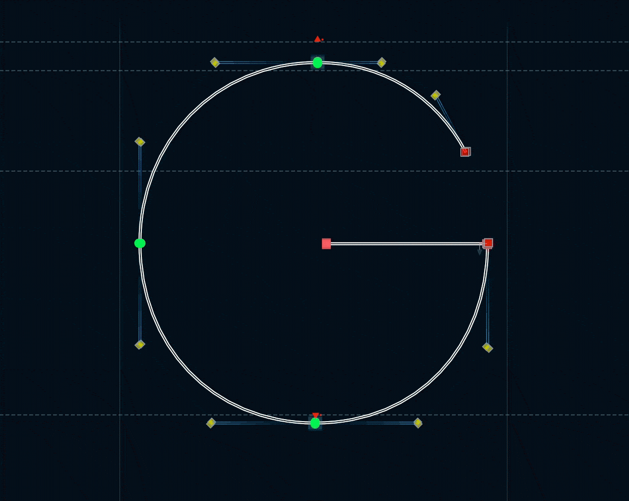
Besides looking cool, what’s the use of this?
Well, have you ever been zoomed so close on simple shape like a period, and you modify it, only to later find out that you were in the wrong master?….yeaaahhh.
So these colors help you avoid that mistake.
Also, check this out:
On the same letter, click the Matchmaker tool (hearts on the toolbar). Even more rad—
What a way to showcase your work.
Love it!