Briem’s notes on type design: Pesky capitals
Hard choices
Some capitals don’t yield easily to grids and modules, at least not as simple as ours. The diagonal we’re using does not make a good letter M. It offers two possibilities, both of them bad.
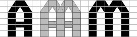
Here’s the first. We can base the letter M on the letter A, but it doesn’t look right. The middle is too narrow.
In the second approach, we can try using the letter N as a starting point. It is even worse than the letter A. The middle of this letter M is far too wide.
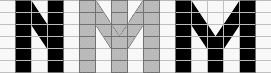
At this point, proper training can help. Remember testing and comparing? Good; we’ll do a bit of that. Let’s make half a dozen variations.

This line shows a gradual change in the letter M. On the left, the gap in the middle of the letter is too wide. On the right, it is too narrow. The third letter from the right gets my vote.
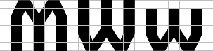
The shape of the letter M should also work in the letters W and w. This one does.
Some diagonals, such as in the letters M and N, can be set upon and overpowered. In others letters, victory is hardly worth the trouble. We will come to them before long. But first, we’ll look at double curves.
Insufficient cleavage
When two curves meet, they usually need attention. If they overlap, reach for the scalpel.
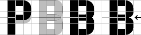
We won’t make an acceptable letter B from the letter P, not even if we shorten the bowl.
As the third example from the left shows, the two bowls overlap too much. But there is enough white space between them in the letter B on the right. Here’s a way of doing it.

Start with the usual curve. Leave the lower end of the Bézier curve where it is. Shorten the curve by a third of a rectangle.
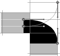
Make a copy of the new curve, flip it vertically, and put the lower end two-thirds down into the same rectangle.
Remove the overlap, and you’ve made a nice double curve.

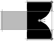
With the new double curve, we can make the letters B R X and x.
The nonconformists
The letters Z and K challenge and defy the grid we set up. It is possible, of course, to assemble them from the same modules as the other characters.
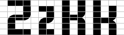
The results are awkward, and illegible as well. The letter Z could be mistaken for a bad numeral 2. The letter K is too close to the letter H.
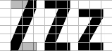
A diagonal of the same thickness as a stem makes a good letter Z. It is slightly wider than two grid rectangles. How much is best decided by making a few variations.
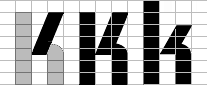
We have already defined the letter R, so the letter K is easy. The lower half is just the same. The diagonal is one rectangle wide from end to end.
Notes on type design. Copyright © 1998, 2001, 2022 Gunnlaugur SE Briem. All rights reserved. Republished with permission in 2022 by Fontlab Ltd.